
- Print Business Cards in Sugar Land – Same Day Service
- Copying Services
- Document Printing, Finishing & Lamination in Sugar Land
- Flyers
- Print Banner in Sugar Land | Same-Day Banner Printing Near Me
- Graphic Design
- Photo Printing
- Postcard Printing
- Document Printing
- EDDM Full Service Postcards
- FotoZoomer Large Format Printing


Printing & Laminating Menu for Restaurant.
Learn the complete process of printing & laminating menu for restaurant. This guide covers design, paper choices, file prep, and costs to get professional results.
Businessmailboutique
11645 S. Hwy 6
Sugar land, Texas 77498 United States (US)
Email: info@businessmailboutique.com
Route
You’re standing in the dining room, flipping through menus that are smudged, curled at the corners, and already out of date. The food may still be strong, but the menu in a guest’s hand is doing the opposite of a good first impression, it’s making the place feel tired. A printing menu for restaurant project works best when it fixes that problem in a way that’s durable, brand-consistent, and easy to update for dine-in, takeout, and delivery.
Your Menu Is More Than Just a List of Food
A restaurant owner usually spots the problem at the table, not at the printer. A server sets down a menu that’s stained from soup, soft from handling, and already out of date on specials, and the room feels less polished before anyone orders. That is why menu printing is part of the guest experience and part of the operating budget. Physical menus get replaced as prices change, specials rotate, and wear adds up, and the cost of those reprints can be easy to overlook until the stack starts shrinking fast. For a practical sense of the range, Business Mail Boutique’s color printing cost guide is a useful reference point for how paper choice, color coverage, and quantity affect the bill, while industry benchmarking on menu printing shows that finished menus can vary widely based on stock, color, size, and volume.
A good menu has three jobs at once. It has to sell, it has to hold up in a dining room that sees constant use, and it has to match what guests see online when they check your website or delivery apps.
Practical rule: if the printed menu and the digital menu look like they belong to different restaurants, guests notice that disconnect immediately.
That is why the strongest projects start with a clear plan for the physical menu and the other touchpoints it needs to match. A printed menu should not be treated as a one-time file that only works on paper. It should belong to the same system your team uses on the website, on QR ordering pages, and in delivery listings, with the printed piece doing what it does best, helping guests read quickly, decide confidently, and trust what they are ordering. In a hybrid dining setup, the primary job is consistency, because a menu that looks good on screen but folds poorly, smudges easily, or breaks under daily handling creates extra cost and extra confusion.
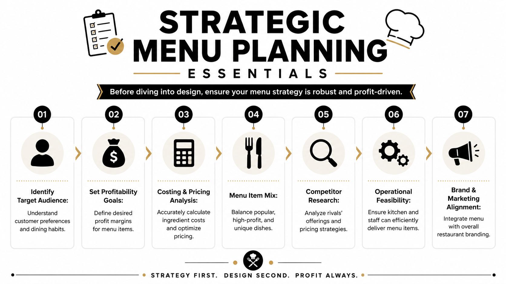
Strategic Menu Planning Before You Design
Before anyone picks fonts or paper, the menu needs a business decision behind it. The cleanest menus usually come from menu engineering, where you look at item sales, profit information, and placement together instead of guessing what should get attention. In practice, that means reviewing what sells, what earns well, and what deserves the best real estate before the file ever gets sent to print.
Start with sales, not decoration
The basic workflow is straightforward. Collect item sales over a defined period, pair that with profit data, and use that information to decide which dishes deserve prime placement and which ones can move lower on the page. Industry guidance on menu engineering also converges on keeping menus to one or two pages when possible, using clear category headings, and placing high-margin items in the visual golden triangle where guests naturally look first (Altametrics on restaurant menu engineering). That’s where good design starts, because the menu should reflect how people order, not just how the brand looks in a mood board.
Practical rule: the best-looking menu that buries profitable items isn’t a good menu.
Build one system for print and digital
Modern menu planning has to account for both the table and the phone screen. A layout that works on a folded paper menu may need a second life on your website or on delivery platforms with very different dimensions and item flow. That’s where consistency matters more than novelty, because guests often judge your in-person menu by what they already saw online.
The easiest way to keep that consistency is to create a master menu system with reusable elements, category names, photography style, icon set, and item naming rules. Then the printed version can be adapted without breaking the brand. If your team needs a wider marketing layout later, a resource like Custom Sticker Shop design options can be useful as a reference point for how design assets get adapted across different formats, even though a restaurant menu still needs its own production standards.
A useful planning checkpoint is cost visibility. Before design gets too far, compare the menu project against broader print spending, including other collateral like flyers or inserts. A practical budgeting reference is Business Mail Boutique’s color printing cost page, especially if you’re trying to understand how menus fit into the rest of your printed materials. That kind of comparison helps prevent surprise revisions when you realize the menu needs to coordinate with other branded pieces, not stand apart from them.
Designing and Preparing Print-Ready Files
A menu file can look polished on a laptop and still print poorly if the setup is wrong. I always tell restaurant managers to design for the press first, because the screen can hide problems that show up fast on paper. Keep the file in CMYK, not RGB, and build artwork at a minimum of 300 DPI so the final print holds detail after the file moves from bright pixels to ink on stock (Resmio on creating a restaurant menu).
Treat color like a print problem, not a screen problem
RGB is built for screens, while CMYK is built for ink. If the file stays in RGB too long, colors can shift at press and come back looking dull, too dark, or off-brand. I have seen that happen most often with menus that use warm neutrals, deep reds, or light text on dark backgrounds, because those combinations depend on careful press setup and good proofing.
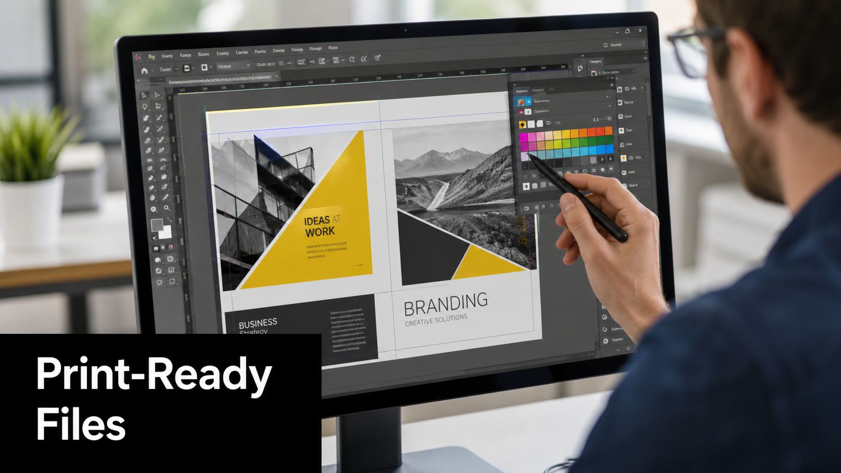
The image below is a reminder that print files are a technical job, not just a visual one.
Keep the file sharp and readable
At 300 DPI, photos and logos stay crisp enough for commercial printing, and simple typography holds up better under restaurant lighting. That matters because readability affects ordering speed. If guests have to squint, the menu is working against service instead of helping it.
Colors on a monitor can lie. A proof tells you what the paper will actually do.
A production file also needs enough safety margin around the edges so content does not get cut off. That is why print shops keep warning against sending a layout that looks fine on screen but was never built with trim in mind. If you are coordinating the menu with other branded pieces, review Business Mail Boutique’s professional brochure printing page and compare the setup notes. Brochures and menus follow the same basic discipline, clean margins, readable hierarchy, and correct print specs.
A local print partner can catch problems a template will miss. That matters even more if your menu has to hold up in the dining room and still match the look of your delivery inserts, takeout labels, or seasonal specials. If your team is comparing design systems across formats, Custom Sticker Shop design options is a useful reference for how artwork gets adapted to different print surfaces without losing brand consistency.
Choosing the Right Paper Finishes and Folds
Paper choice changes how a menu feels in the hand before a guest reads a single item. A thin sheet says temporary. A heavier stock says permanence and care. The wrong choice shows up fast in a restaurant because menus get touched, cleaned, stacked, carried, and sometimes spilled on all in the same shift.
Match the material to the room
Guidance on menu printing often under-explains durability trade-offs. Laminated menus are more durable and easier to clean, while thicker stock can signal luxury better than a flimsy sheet can (Etundra on printing restaurant menus). That difference matters more than many owners expect, because a high-turnover café and a takeout-heavy concept don’t put the same stress on a menu as a fine-dining room does.
| Menu Paper & Finish Comparison | Best For | Durability | Cost |
|---|---|---|---|
| Laminated menu | High-traffic dining rooms, cafés, spill-prone service | High | Higher upfront |
| Heavier cardstock | Upscale concepts, premium brand feel | Moderate | Moderate to higher |
| Standard paper stock | Short-term specials, fast updates | Lower | Lower |
| Folded format | Larger menus with organized sections | Depends on stock | Varies by stock and print complexity |
If you need folding, keep the structure simple enough that guests don’t fight the paper. Bifold and trifold formats work best when the menu hierarchy is clean and each panel has a purpose, not when the layout is crammed with unrelated offers.
Choose the finish for how it gets handled
Gloss can make photos pop, but it also reflects light. Matte reduces glare and often reads better in warm indoor lighting. Uncoated stock feels softer and more natural, while lamination adds wipeability and protection. The decision should follow how the menu is used, not just how it looks in a mockup.
For restaurants evaluating finishing services, Business Mail Boutique’s lamination page is a practical place to understand how protective finishing fits into a real print workflow. That’s especially useful if your menus need to survive frequent cleaning or you’re trying to stretch a seasonal menu longer without replacing it right away.
Good print choice: pick the stock that matches how often a server will touch, wipe, and replace the menu.
The menu should feel like part of the brand, but it also has to work as a physical object. A sturdy finish that handles the room well usually beats a prettier option that falls apart after a week of service.
Navigating the Ordering and Proofing Process
The ordering stage is where menu mistakes get expensive, because the file is no longer hypothetical. A printer can fix a lot before production starts, but only if the quantity, stock, finish, and layout details are clear and the proof gets checked with real care. Physical menu printing is a recurring expense, so it pays to slow down before you approve a full run.
Ask for the right quote up front
A useful quote should cover more than the design file. The printer needs quantity, size, sides, stock, finish, and whether the job includes lamination or folding. If those details are vague, the quote will not help much when you compare options or schedule a launch.
For a standard 8.5×11 two-sided batch of 150 menus, one published example puts the cost at roughly $30, or about $0.20 each, with heavier cardstock increasing the price (Menujo on menu printing cost). That does not mean every job should target that exact setup, but it does show how stock and quantity affect the final number.
Proof every menu before you print the whole run
A digital proof is useful, but a hard-copy proof is better when you care about how the menu reads in the dining room. Screen-to-print mismatch is common, and a test print helps confirm contrast, cropping, and layout before you commit to volume. One industry guide warns against ordering large quantities without a hardcopy proof, because a typo or layout problem can turn into a pile of unusable stock.
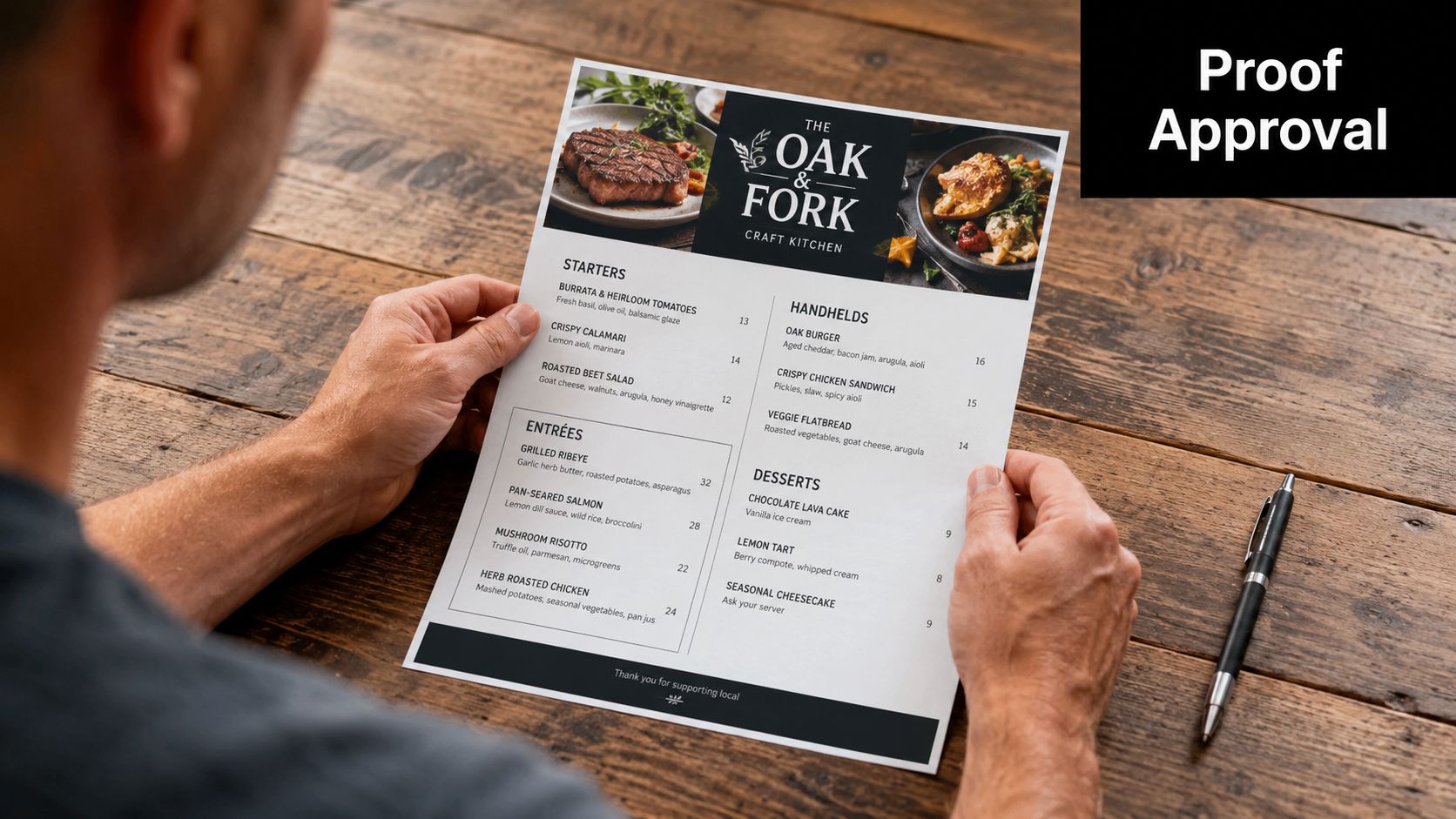
A print shop owner sees the same pattern again and again. The restaurant that sends a clean file, approves a proof, and asks questions early gets a better result than the one that rushes the order and hopes the PDF is enough. Local printers matter here because you can see stock samples, talk through finish options, and catch problems before they become a reprint.
If you need a quick reference for document handling, Business Mail Boutique LLC also offers print services that support business materials and finishing under one roof. That matters when a restaurant wants menus, inserts, or other print pieces handled without passing files through multiple vendors.
Common Pitfalls and Pro Tips for Local Printing
The most expensive menu mistakes are usually boring ones. Typos slip through. Fonts get too decorative to read. Logos arrive too small. Bleed gets ignored. The file that looked polished on a laptop turns into a weak print job because nobody checked the practical details before the order went out.
Avoid the mistakes that cause reprints
Here’s the short list I’d give any new restaurant manager before sending files to press.
- Proof names and prices twice: A single wrong price or item name can make the whole batch unusable.
- Keep typography simple: Decorative fonts may look stylish on screen, but they often slow down reading.
- Use logos at print resolution: Small web graphics can look soft or pixelated on paper.
- Respect the trim area: Content too close to the edge risks getting cut off.
- Match the finish to the room: A beautiful finish that smears, reflects, or wears badly won’t serve the guest well.
That’s also where menu design and menu management meet operational considerations. If the menu changes often, the file needs to be built for updates, not just one perfect launch. If the concept leans on delivery and takeout, the printed version should still echo the same item names and visual language the guest sees on screens.
Use your local printer as part of the process
A local shop gives you advantages that online ordering usually can’t. You can hold paper samples, compare finishes in person, and ask whether the stock will feel too flimsy or too glossy under your lighting. You can also get a physical proof faster, which matters when the menu change is tied to a reopening, a seasonal shift, or a new service launch.
Local expertise saves money when it catches problems before ink hits paper.
For a restaurant that needs practical help with printing and finishing, working with a nearby provider keeps the feedback loop short. If the print shop understands menus, it can flag issues with readability, folding, or durability before the job is locked in. That’s the primary advantage, not just convenience, but fewer surprises and a menu that works in the room it was made for.
If you’re getting ready to print menus for a restaurant in Sugar Land or you need help choosing stock, finish, or proofing, contact Business Mail Boutique LLC and ask for help with a menu file before you place the full order.

Related posts

Custom Memorial Glasses Engraved in Three Hours in Sugar Land
When a customer needed eight personalized glasses for a memorial, Business Mail Boutique completed the engraving or...

Custom Martini Glass Engraving in Sugar Land, TX
Custom Logo Engraving on Martini Glasses in Sugar Land, Texas.
Business Mail Boutique recently completed a beautiful custom engravin...

Custom Engraved Wine Glasses for a Golf Club Event in Sugar Land, TX
Custom Engraved Wine Glasses for a Golf Club Event in Sugar Land.
Custom wine glass engraving in Sugar Land, TX at Business Mail Bouti...