
- Print Business Cards in Sugar Land – Same Day Service
- Copying Services
- Document Printing, Finishing & Lamination in Sugar Land
- Flyers
- Print Banner in Sugar Land | Same-Day Banner Printing Near Me
- Graphic Design
- Photo Printing
- Postcard Printing
- Document Printing
- EDDM Full Service Postcards
- FotoZoomer Large Format Printing


Printing a Brochure: A Pro Guide for Small Businesses
Businessmailboutique
11645 S. Hwy 6
Sugar land, Texas 77498 United States (US)
Email: info@businessmailboutique.com
Route
You’re probably here because the brochure is half designed, someone on your team pulled a few images from the website, and now the big question is simple: how do you get this thing printed without wasting money or ending up with a box of pieces that look wrong?
That’s the moment when printing a brochure stops being a design exercise and becomes a production job. The fold has to fit the message. The file has to be built for print, not for a screen. The paper has to feel right in a customer’s hand. And before you approve a full run, someone needs to catch the typo, the washed-out photo, or the panel that folds in the wrong order.
A local print shop helps most on the parts that are hardest to judge online. You can hold paper samples, review a proof with a real person, and fix small mistakes before they become expensive ones. If you need something fast, same-day pickup can matter just as much as price.
Table of Contents
- First Decisions Your Brochure Format and Fold
- How to Prepare a Flawless Print-Ready File
- Selecting Paper and Finishes That Impress
- Digital vs Offset Printing What Is Right for You
- Final Steps Proofing and Printing Your Brochure
First Decisions Your Brochure Format and Fold
Before you worry about coating, paper stock, or turnaround time, decide what the brochure physically needs to do. A brochure isn’t just a sheet with graphics on it. It opens in a sequence, it reveals information in stages, and it either guides the reader smoothly or confuses them immediately.
The long history of the format still shapes modern printing. Standard brochure sizes today are usually 8.5″ x 11″ in North America and A4 in Europe, reflecting print conventions that have carried forward for generations, as noted in this history of the brochure format.
Start with size before you think about style
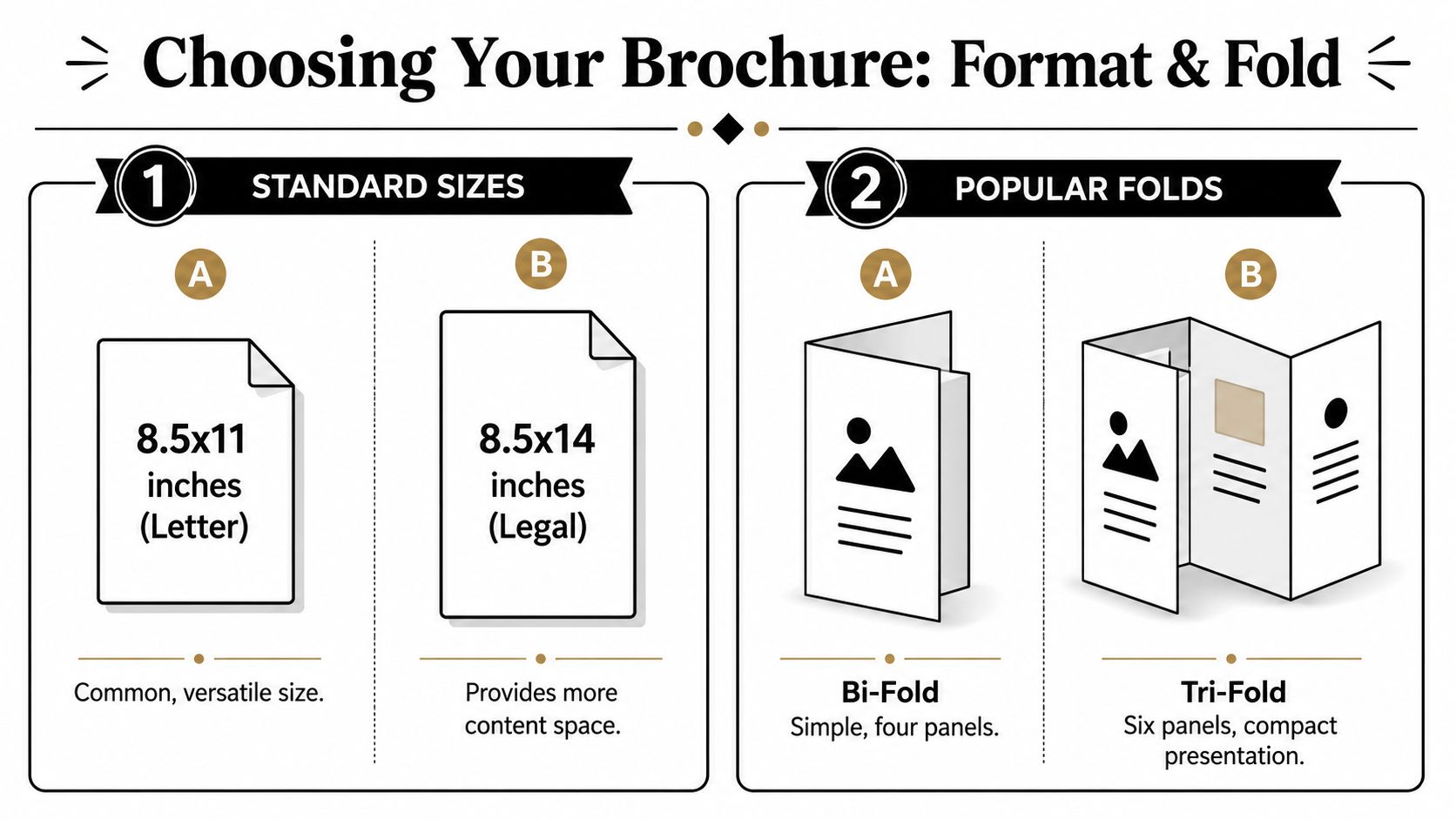
For most small businesses, the first practical choice is between a standard letter-size sheet and a longer format such as legal size.
8.5 x 11 inches works because it’s familiar, easy to design, easy to rack, and easy to hand out. It fits a wide range of uses, from service menus to event handouts to company overviews.
8.5 x 14 inches gives you more room when the content needs breathing space. That extra length helps if you’re listing services, showing pricing tiers, explaining a process, or laying out a menu with many categories.
A good printer will usually ask one question early: where will this brochure live? In a brochure rack, on a front counter, in a salesperson’s folder, in a waiting room, or handed out door to door. That answer often narrows the size choice fast.
Practical rule: If your content feels cramped on screen, changing the fold alone usually won’t fix it. A larger sheet may be the better move.
Choose a fold that controls the reading flow
The fold decides how information unfolds. That matters more than commonly realized.
Here’s how the common options work in real jobs:
- Bi-fold works best when you want a clean, simple presentation. It creates four panels and feels closest to a small booklet. That makes it a strong fit for event programs, real estate feature sheets, or a company introduction where the front cover opens into a broad inside spread.
- Tri-fold is the standard choice for many local businesses because it creates six panels in a compact shape. It’s useful when you need to organize content into sections like services, pricing, testimonials, and contact details. Restaurants, clinics, salons, and home service companies often do well with this format.
- Z-fold opens like a map. Each panel reveals the next without one panel tucking inside another. That makes it easier to present a sequence, timeline, step-by-step process, or route-style information.
- Gate-fold creates a reveal. The outer panels open inward, then expose a larger center panel. It’s more theatrical and usually better for premium promotions, product launches, or visuals that deserve a dramatic opening.
What doesn’t work is choosing a fold because it “looks nice” without mapping the content first. A tri-fold with a long, uninterrupted block of text is hard to read. A gate-fold for a simple announcement usually adds cost without adding value.
A local print partner helps here because they’ve seen what happens after design files become physical pieces. They know when a panel is too crowded, when a fold will stress a heavy sheet, and when a simpler format will sell the message better.
How to Prepare a Flawless Print-Ready File
Most brochure problems start before ink ever touches paper. The design may look sharp on a laptop and still fail on press because the file was built for digital viewing, not for production.
That’s why file prep deserves more attention than people usually give it.
The three setup rules that aren’t optional
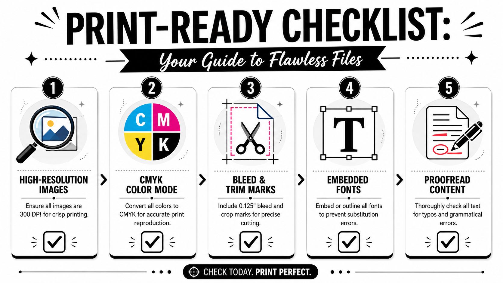
For professional brochure printing, images need to be at least 300 DPI, files should be set up in CMYK, and the document needs a 1/8-inch bleed, according to Camelot Print and Copy’s brochure printing guide. That same guidance also warns that website images are typically 72 DPI, which often leads to blurry printed output when used as-is.
If you’re not used to print terminology, imagine it this way:
- 300 DPI is image clarity for paper. A photo that looks acceptable on a phone can fall apart when printed larger.
- CMYK is the color language printers use. RGB is for screens. If a brochure is designed in RGB, colors can shift when converted later.
- Bleed is the safety area beyond the trim edge. If background color or an image stops exactly at the cut line, even a tiny trimming variation can leave a white sliver.
One outside resource that explains image quality clearly, even for non-designers, is T-Shirt Envy’s guide to printing resolution. It’s useful when someone on your team says, “This image looked fine online.”
Later in the process, if you need a shop that can review files and help you move from upload to pickup without a long back-and-forth, a local option like online document printing and same-day order pickup can save time.
If the background goes to the edge, the artwork must extend past the trim. Printers cut stacks, not single sheets with surgical precision.
The file checks that prevent production headaches
A strong print-ready file usually comes down to a short checklist:
- Check every image at full size. Don’t judge from the thumbnail in your design program. Open the file and confirm it holds up at the size it will print.
- Embed or outline fonts. If the printer’s system swaps your typeface for a default font, the layout can reflow. That can move text boxes, break line spacing, or create awkward panel breaks.
- Export a press-ready PDF. Native files can work, but PDF is usually safer because it locks down layout elements more reliably.
- Proofread after export. Designers often proof the editable file and forget to proof the final PDF. That’s the wrong order. The exported file is the one that gets printed.
This is also where local shops earn their keep. When you can sit with someone at the counter or email a file and get practical feedback, you catch problems early. A good print technician will notice when panel order looks wrong, when type is too close to the fold, or when a photo won’t survive enlargement.
For anyone handling printing a brochure for the first time, that review is often the cheapest part of the whole job.
Here’s a quick visual walkthrough that reinforces the basics of file setup before you send anything to press:
Selecting Paper and Finishes That Impress
Customers react to paper before they read the headline. They notice stiffness, texture, sheen, and weight almost instantly. That reaction shapes how they judge the business behind it.
That’s why paper and finish aren’t minor specs. They’re part of the message.
Paper weight sends a message before anyone reads a word
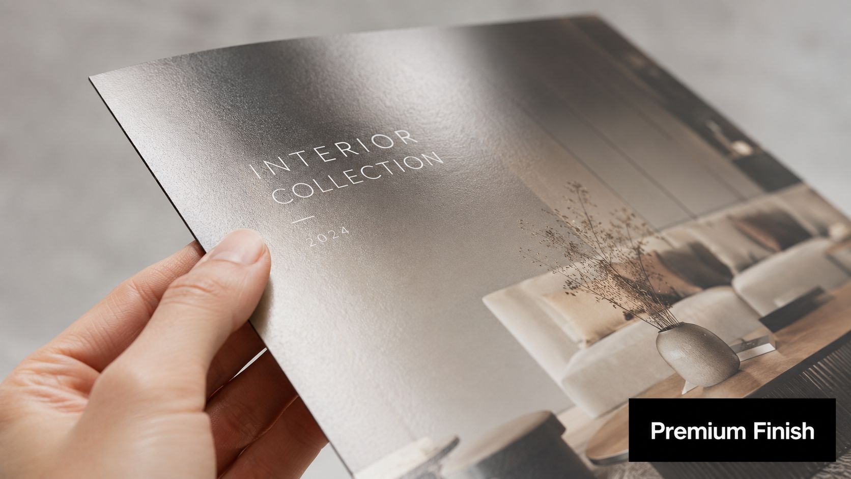
Heavier paper feels more deliberate. Lighter paper feels economical and easy to distribute. Neither is automatically right or wrong. The right choice depends on where the brochure will be used and what kind of impression it needs to create.
A leave-behind for a premium service should usually feel substantial in hand. A stack of brochures for broad distribution may need to stay lighter so it folds cleanly, travels well, and fits the budget.
There’s also a perception gap businesses should pay attention to. Recent 2024-2025 studies reveal that 45% of consumers equate heavy, textured paper with higher brand credibility, yet 60% of small businesses default to the cheapest option due to confusion over cost-benefit trade-offs, according to this FAQ guide on brochure printing decisions.
That tracks with what print shops see every day. Businesses often spend time polishing the copy and logo, then undercut the whole piece with paper that feels disposable.
Finish changes both appearance and usability
Finish affects both looks and function.
- Gloss suits brochures with bold photography, saturated color, food images, travel scenes, or product shots that need pop.
- Matte feels quieter and more refined. It reduces glare and often works better for professional services, luxury presentation pieces, and text-heavy designs.
- UV or other premium coatings add protection and visual punch, but they also raise cost and aren’t always necessary for a simple local handout.
A brochure with excellent design on the wrong paper still feels off. People may not know why, but they notice.
The smartest way to choose isn’t from a website thumbnail. It’s by handling samples in person. Put gloss and matte side by side. Bend the sheet. Open and close the fold. See what fingerprints do to the surface. Hold it under bright indoor light.
That’s where a local print shop has a practical advantage over a purely online order form. Someone can hand you actual stocks, explain how the finish will affect photos and text, and warn you if your chosen sheet may crack at the fold or feel too thin for the use case.
Digital vs Offset Printing What Is Right for You
Production method changes the economics of printing a brochure. Two jobs with the same design can make sense on completely different equipment depending on quantity, timing, and how exact the color needs to be over a long run.
The cost range makes that clear. Standard brochure printing typically costs $0.25 to $1.10+ per piece, and larger quantities can bring the unit cost down to $0.25 to $0.35 for 1,000+ units, compared with $0.75 to $1.10 per piece for 100 units, with quantity identified as the biggest cost factor in Publitas’ brochure cost breakdown.
When digital makes more sense
Digital printing is usually the better choice when speed and flexibility matter more than squeezing every possible cent out of a large run.
It fits jobs like:
- short runs for a local event
- revised brochures with frequent updates
- test quantities before a larger order
- rush jobs that need quick turnaround
If a customer walks in needing brochures for tomorrow morning, digital is usually where the conversation starts. It also works well when you want to print only what you need now, then reorder later after updating details.
When offset is worth discussing
Offset printing becomes more attractive when the quantity is high enough to justify setup and when consistency across a large run matters.
That’s why bigger campaigns, broad distribution, and larger regional promotions often point toward offset. The setup takes more planning, but the economics improve as the run grows.
Here’s the simple comparison most buyers need:
| Factor | Digital Printing | Offset Printing |
|---|---|---|
| Ideal quantity | Smaller runs | Larger runs |
| Turnaround time | Faster, often better for rush work | Slower setup, better for planned runs |
| Version changes | Easier to update between runs | Better when artwork stays fixed |
| Per-piece economics | Strong for low quantities | Stronger as volume increases |
| Color consistency over long runs | Good for many business jobs | Often preferred for long, uniform runs |
If you want to discuss the best fit with a shop that handles broader production needs, commercial printing services are where that conversation usually starts.
Final Steps Proofing and Printing Your Brochure
The last stage is where expensive mistakes either get caught or get multiplied. A brochure can have the right format, a clean file, and a good paper choice, then still fail because nobody slowed down to proof it properly.
That’s not a small risk. Recent industry analysis indicates that 34% of small business marketing budgets are wasted on flawed print runs due to skipped or inadequate testing protocols, according to RapidColor’s article on brochure printing tips.
What to check on a proof
Start with the digital proof for content and layout. That’s where you catch spelling errors, wrong phone numbers, bad panel order, and awkward spacing.
Then check a physical proof if the piece matters enough to justify one. That’s where you catch things screens hide, such as color feeling too dark, paper feeling too light, folds landing too close to text, or photos losing detail.
Use a short approval list:
- Read every panel slowly. People skim what they already know and miss obvious mistakes.
- Check folds in sequence. Make sure the outside cover, inside panels, and back panel all appear in the intended order.
- Look at trim safety. Text and logos need enough distance from edges and folds.
- Judge the piece in real light. Office lighting, daylight, and lobby lighting can change how colors feel.
Shop-floor advice: The best proofreader is often the person who hasn’t seen the design ten times already.
Why local pickup and local advice still matter
Local service beats convenience-only ordering. If the brochure is urgent, same-day production and pickup can save an event, a sales meeting, or an opening day. If the color looks off on the proof, you can have a direct conversation instead of opening a support ticket and waiting.
Local print shops also help with decisions that don’t translate well through a web form. You can compare paper in person, ask whether a fold will work on a thicker stock, and get practical feedback from someone who sees these jobs every day.
And if speed matters, it helps to know what’s realistic. A service built around rush printing and same-day success is useful when the timeline is tight and there isn’t room for avoidable delays.
A good final habit is simple. Don’t approve the full run the same minute you receive the proof. Step away, come back with fresh eyes, and review it once more. That extra pass catches more mistakes than people expect.
If you need help printing a brochure without guesswork, Business Mail Boutique LLC offers practical local support for file review, fast turnaround, paper and finish guidance, and pickup options that make urgent jobs easier to manage. For small businesses that want a real print partner, not just an upload form, that kind of hands-on help can prevent costly mistakes before they reach the press.

Related posts

Custom Memorial Glasses Engraved in Three Hours in Sugar Land
When a customer needed eight personalized glasses for a memorial, Business Mail Boutique completed the engraving or...

Custom Martini Glass Engraving in Sugar Land, TX
Custom Logo Engraving on Martini Glasses in Sugar Land, Texas.
Business Mail Boutique recently completed a beautiful custom engravin...

Custom Engraved Wine Glasses for a Golf Club Event in Sugar Land, TX
Custom Engraved Wine Glasses for a Golf Club Event in Sugar Land.
Custom wine glass engraving in Sugar Land, TX at Business Mail Bouti...