
- Print Business Cards in Sugar Land – Same Day Service
- Copying Services
- Document Printing, Finishing & Lamination in Sugar Land
- Flyers
- Print Banner in Sugar Land | Same-Day Banner Printing Near Me
- Graphic Design
- Photo Printing
- Postcard Printing
- Document Printing
- EDDM Full Service Postcards
- FotoZoomer Large Format Printing



How to Improve Print Quality for Professional Results.
Learn how to improve print quality with practical steps on file prep, color settings, printer calibration, paper choice, and when to use a professional print.
Businessmailboutique
11645 S. Hwy 6
Sugar land, Texas 77498 United States (US)
Email: info@businessmailboutique.com
Route
A ream of flyers lands on the counter, and the blues look flat. A wide-format banner that should show a confident brand red leans orange instead. The client wants an explanation by noon, but changing the printer’s DPI setting won’t tell you what went wrong.
That situation is familiar in a busy Sugar Land print shop. Consistent results come from controlling the entire production chain, including the source file, color conversion, device calibration, substrate, environment, and finishing. Print quality is a measurable system, not a judgment made by holding one sheet under a desk lamp.
Table of Contents
- Why Most Prints Look Off and What Fixes It
- Preparing Files for Sharp, Consistent Output
- Color Profiles, Color Spaces, and Proofing
- Printer Settings, Calibration, and Routine Maintenance
- Paper, Ink, and the Hidden Role of Humidity
- When In-House Printing Ends and a Print Shop Begins
- Your Print Quality Checklist and Next Steps
Why Most Prints Look Off and What Fixes It
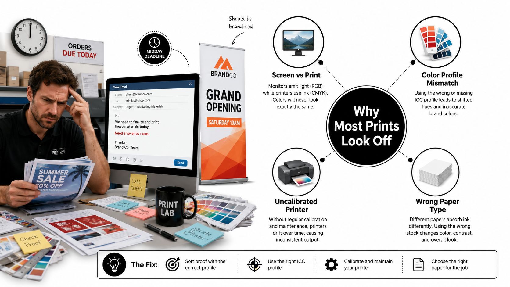
A dull flyer usually has a traceable cause. The source may have gone through an RGB-to-CMYK conversion, the monitor may be uncalibrated, the media preset may be wrong, or the paper may have absorbed moisture. An orange brand red on a banner can point to the ink set, substrate profile, nozzle condition, or a color enhancement setting that changed the approved artwork.
Visual inspection alone cannot isolate the fault. Human vision adapts to surrounding light, neighboring colors, and paper tone. ISO/TS 15311-1 defines print-quality metrics, measurement methods, and reporting requirements for printed sheets across classes of printed products. ISO/TS 15311-1 gives operators a standards-based way to compare output across presses, substrates, and workflows.
The five inputs that control the result
Treat each job as a connected production chain:
- Source files: Resolution, transparency, fonts, bleed, and color mode determine what the device receives.
- Color conversion: Profiles control how RGB colors are translated into a print gamut.
- Device calibration: A printer can drift even when the file has not changed.
- Substrate: Coated, uncoated, glossy, matte, and synthetic media reproduce dots and absorb ink differently.
- Finishing: Folding, scoring, trimming, lamination, and mounting can change the perceived result.
The three most common silent failures are an uncalibrated display, paper stored in uncontrolled humidity, and a printer using a generic driver preset. A monitor can show a saturated color as achievable when the selected ink and paper cannot reproduce it. Moisture can cause curl, streaks, and uneven feeding. A default driver may apply sharpening or color enhancement that conflicts with a managed workflow.
Practical rule: Change one production input at a time, record the result, and compare it with an approved proof.
A small business may need a more controlled digital printing workflow when desktop output becomes inconsistent. The target is repeatability, so the next run resembles the approved run.
What ISO process control changes
ISO 12647-2:2013 specifies controlled process parameters for four-color sheet-fed and web-fed offset printing. Related ISO print-production guidance connects file preparation, screening, and press settings with recognized process-control targets, including three to six times the resolution of continuous-tone data for line-work and continuous-tone data at or above 120 cm−1.
The practical lesson is direct. Sharp artwork starts before the printer receives the PDF, and color accuracy depends on a controlled chain rather than a single DPI setting. Measuring the inputs, conditioning the substrate, and approving a proof make quality repeatable.
Preparing Files for Sharp, Consistent Output
A file can look clean on screen and still produce soft type, clipped artwork, or uneven edges at the press. File preparation sets the ceiling for sharpness. Build the document at its final trim size, keep logos and type as vector artwork, and avoid enlarging a low-resolution image just before export.
For photographic regions, use 300 ppi at final trim size as a practical commercial target. Logos, icons, borders, and small type should stay vector whenever possible. Rasterizing them can soften edges, particularly when a brand mark contains fine counters or narrow strokes.
File setup that survives production
Set 3 mm of bleed on every edge where artwork reaches the trim line. Keep important text and logos at least 5 mm inside the trim. Bleed gives the cutter room to work without exposing an unprinted sliver. The safe margin protects live content from minor trimming variation.
Use a native document size that matches the finished piece. A business card, flyer, brochure, or poster should not sit on an oversized artboard and then be scaled during export unless the production team has approved that workflow. Scaling can alter effective image resolution and expose weak edges that were hidden at working size.
| Element | Minimum Spec |
|---|---|
| Photographic regions | 300 ppi at final trim size |
| Line-work relationship | Three to six times the resolution of continuous-tone data |
| Continuous-tone baseline | At or above 120 cm−1 |
| Bleed | 3 mm on each edge |
| Safe margin | 5 mm inside the trim |
| Logos and type | Vector source preferred |
| Fonts | Embedded, or text outlined when appropriate |
| Export format | PDF/X-4 for transparency-aware production |
These technical baselines support controlled production, but they do not replace preflight. Interpret line-work and continuous-tone requirements alongside the actual press, screening method, substrate, and job specification. ISO-oriented process control treats file preparation as one measured input in the production chain, not as a substitute for checking the finished proof.
Export without hiding problems
PDF/X-4 works well when the production workflow supports live transparency and color management. Incorrectly flattening transparency can create stitching, clipped shadows, or unexpected knockout behavior. Keep crop marks outside the bleed area, never through live artwork, and confirm that marks cannot be mistaken for finished content.
Before sending a file to plate or printer, run the same preflight checks on every job:
- Resolution: Inspect every placed raster image at effective resolution, not only its original file size.
- Color mode: Confirm whether the job requires CMYK, tagged RGB, grayscale, or spot colors.
- Profiles: Embed the intended ICC profile so the receiving workflow can interpret the file correctly.
- Overprint: Check black text, white objects, and intentional overprints in separations preview.
- Spot colors: Verify names and callouts, especially for brand colors or special inks.
- Trim and bleed: Confirm the trim box, bleed box, and crop-mark placement.
If the same images serve a website, keep that digital version separate and follow guidance on how to optimise images for speed and SEO. Web compression is not a substitute for print-resolution preparation. For brochures, use the handoff details in this brochure printing guide.
Color Profiles, Color Spaces, and Proofing
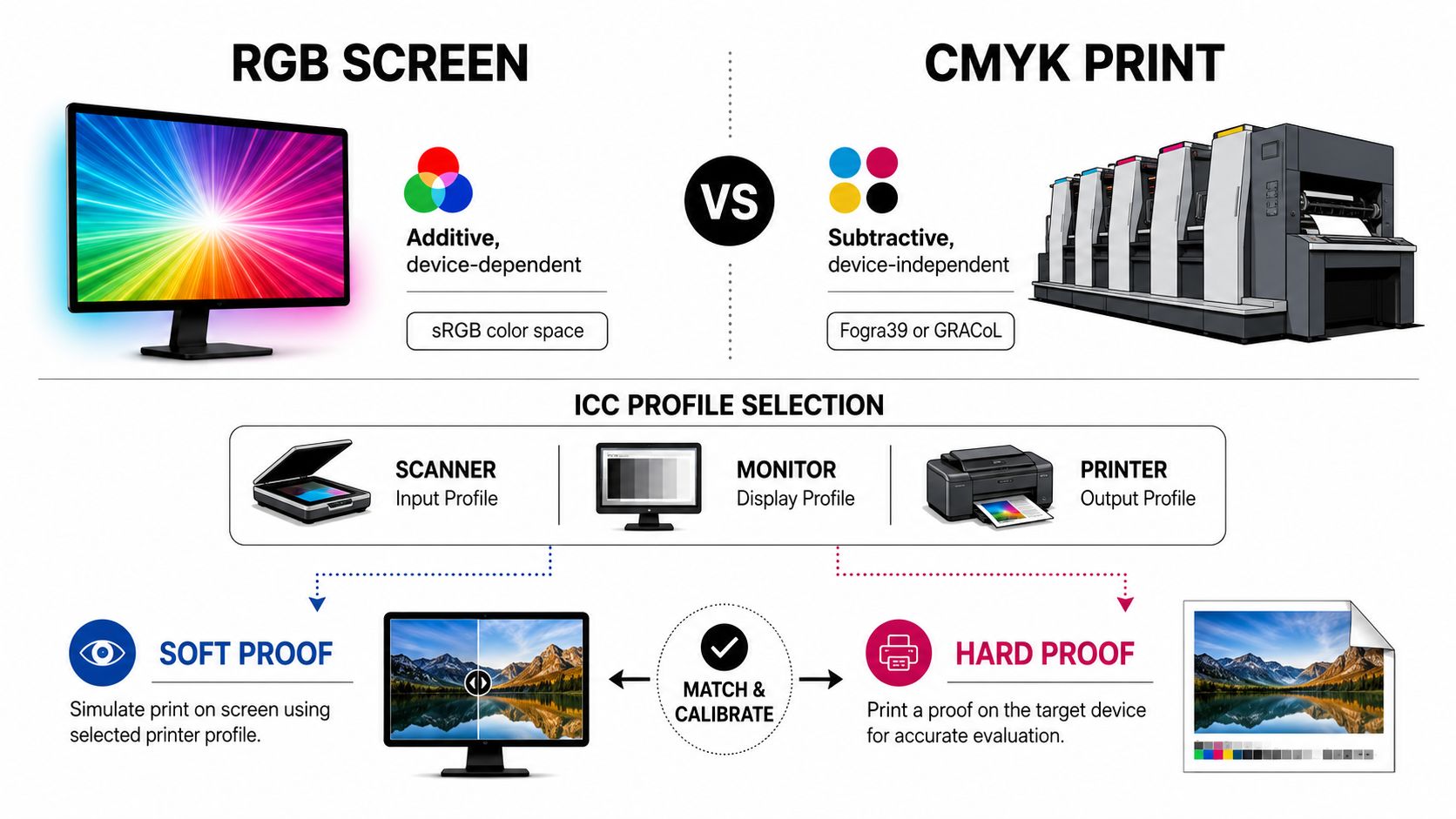
Color accuracy starts with identifying where the color will be reproduced. RGB is an additive, device-dependent screen space that combines light. CMYK is a subtractive print space, where ink and substrate set the available gamut. A screen preview can look correct while the printed result shifts because these systems produce color differently.
An untagged RGB file leaves the receiving software to guess how its values should be interpreted. The same numerical color can change when the workflow assumes another RGB profile or converts directly to a press profile without a defined rendering intent.
Match the profile to the production path
Choose the profile for the press and substrate, not personal preference. Coated offset work may use a GRACoL or SWOP profile according to the agreed production condition. European coated offset workflows may call for ISO Coated v2. Digital toner and inkjet devices need vendor-specific profiles that account for ink, screening, paper, and curing behavior.
One generic CMYK conversion cannot provide consistent output across every stock. A coated sheet, uncoated stock, and banner media can show different color from the same file because the substrate changes ink spread and density. Paper conditioning matters too. Stock that has absorbed moisture or is out of balance with the pressroom can alter dot gain, drying, and the apparent density of a solid.
Color evaluation should use repeatable process controls rather than DPI claims alone. ISO/IEC 22592-1:2024 provides standardized test methods and test charts for evaluating visual image quality in color prints made for typical office environments. ISO/TS 18621-31 addresses perceived resolution with a contrast-resolution chart. The ISO/IEC 22592-1:2024 standard documents the test-method context for assessing sharpness, gamut, and visibility.
Choose the right proof
Soft proofing uses a calibrated monitor and the selected output profile to preview color intent. It helps check layout, tonal relationships, image crops, and obvious gamut problems. A monitor cannot fully reproduce the texture, gloss, absorption, or viewing behavior of the finished substrate.
A hard proof comes from the production device and substrate, or from a proofing system matched to both. It requires more time and cost, yet gives a physical reference for a signature-bound or client-approved job. The proof should be viewed under consistent lighting, with the substrate conditioned in the same general environment as production.
Proofing rule: Use a soft proof for layout and color intent. Use a hard proof when the client, brand manager, or production team must approve the physical result.
Before releasing a color-sensitive job, compare the hard proof under consistent viewing conditions and keep the approval record with the production file. Teams that need controlled output without running the full calibration workflow internally can use professional color copy services. A documented proofing process gives operators a reference they can measure, compare, and repeat.
Printer Settings, Calibration, and Routine Maintenance
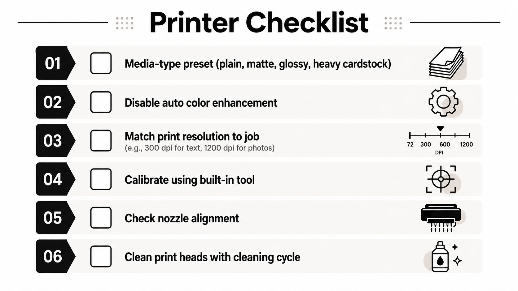
A clean nozzle cannot rescue the wrong media preset. Select the setting that matches the stock, such as plain, matte, glossy, or heavy cardstock. The choice affects ink volume, drying behavior, fuser temperature, and feed handling, so it belongs in the job setup before resolution is adjusted.
Disable automatic color enhancement when a managed profile and approved proof already define the target. Auto vivid, photo enhance, and similar modes may make an unapproved sample look more attractive while shifting it away from the approved result.
Tune for the job, not the menu maximum
Higher resolution does not automatically produce a sharper sheet. It can increase processing time, ink use, or drying demands without improving small type printed on absorbent paper.
Set the target from the job requirement:
- Text and forms: A 600 DPI setting is generally appropriate for crisp office text and line work.
- Photo-grade output: A 1200 DPI setting can support richer photographic detail when the media and device can use that added information.
- Fine art and high-end brochures: A 2400 DPI setting may be justified when the substrate, file, and press workflow support that level of detail.
Treat these as workflow targets, not guarantees. A poorly prepared image, incorrect media preset, or misaligned head can undermine output at any selected resolution. On a production floor, the controlled test print matters more than selecting the largest number in the driver.
Calibrate and maintain with evidence
Run a nozzle check when missing lines, banding, or uneven density appears. Use a head-cleaning cycle for visible streaks, rather than repeating cleanings on a schedule and consuming ink without correcting a defect. Print the built-in nozzle pattern afterward to confirm whether the intervention worked.
Use the device’s alignment page for bi-directional alignment. Production equipment should be checked with a densitometer or spectrophotometer against the applicable ISO 12647 process-control target. This turns calibration into a measurable comparison instead of a sequence of slider changes.
A practical routine includes:
- Weekly cleaning: Wipe the platen and feed rollers with isopropyl alcohol where the manufacturer permits it.
- Paper-dust control: Vacuum dust from trays and feed paths with equipment suitable for the device.
- Toner inspection: Check the fuser when ghosting or repeating marks appear.
- Calibration after change: Recalibrate after a major consumable change or visible color drift.
- Firmware review: Apply compatible updates and document any change in color behavior.
Keep the previous profile, print a controlled test chart, make one adjustment, and record the result. That record shows whether the change improved density, alignment, or color consistency, and gives the next operator a repeatable starting point.
Paper, Ink, and the Hidden Role of Humidity
A clean file can still produce soft dots, curl, streaks, or poor adhesion if the paper and ink are mismatched. Substrate, ink chemistry, storage, and room conditions operate as one process, and the printer cannot correct media that has already changed before it reaches the feed tray.
Uncoated paper draws ink into its fibers. Fine dots lose definition, and duplex sheets can warp when one side carries heavy coverage. Coated stock holds more ink near the surface, which can sharpen detail, but aggressive scoring may crack the coating or printed film when the design and finish are poorly matched.
Ink chemistry sets another boundary. Dye and pigment inks behave differently, while aqueous, solvent, and UV-cured systems each require compatible media and drying conditions. OEM and third-party cartridges also involve a practical trade-off among consumable cost, warranty terms, and color stability.
Condition the media before blaming the printer
Humidity often sits behind streaking, smearing, curl, and feed complaints. A 2024 review in Heliyon notes that inkjet media should be stored with controlled humidity and temperature, acclimated before use, and remoistened under controlled conditions where appropriate. The review of media conditioning and inkjet quality reports detrimental effects at 80% RH, while industry guidance commonly targets about 45% to 55% RH for stable printing.
Those figures do not define one tolerance for every device or substrate. Measure the room, condition the media, and record the result. That approach aligns print quality with measurable process control rather than guesswork.
| Substrate | Recommended Ink | Target RH Range | Common Issue if Mismatched |
|---|---|---|---|
| Uncoated paper | Ink or toner approved for the stock | About 45% to 55% RH | Absorption, feathering, curl, or waviness |
| Coated paper | Compatible pigment, dye, or toner system | About 45% to 55% RH | Slow drying, scuffing, or score cracking |
| Synthetic media | Vendor-approved solvent, UV, or compatible toner system | Controlled environment | Smearing, poor adhesion, or static |
| Wide-format banner media | Vendor-approved solvent, latex, or UV system | Controlled environment | Banding, edge curl, or uneven drying |
Keep paper sealed until it can acclimate in the press room. Place a hygrometer near the equipment and check conditions before a wide-format run or any job requiring even coverage. If defects appear after a weather change or a new paper delivery, test the environment and media first. Then adjust printer settings only after those variables are under control.
When In-House Printing Ends and a Print Shop Begins
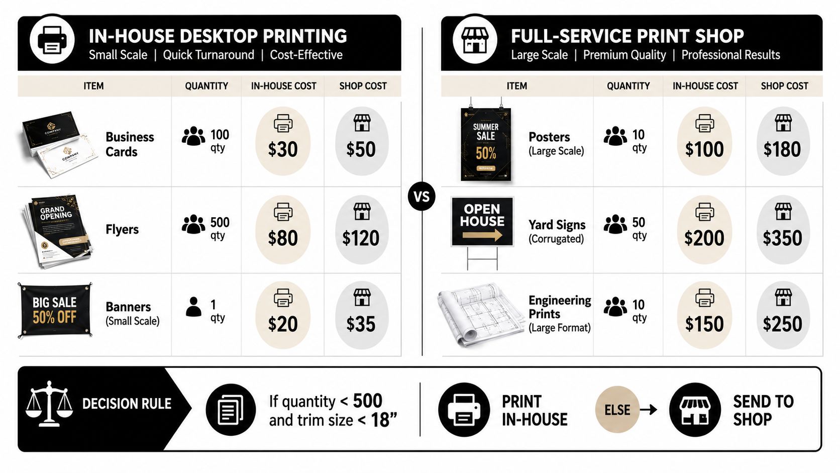
A desktop printer can produce a useful proof in minutes, yet the same device may struggle with a long run, heavy coverage, or large-format media. In-house printing works best when timing, privacy, or a small quantity matters more than production scale.
The trade-off shifts as quantity, size, finishing, and color expectations increase. A short batch of business cards may be practical if trimming and registration are acceptable. A larger flyer run can expose banding, registration variation, drying limits, and the labor cost of repeated operator checks. Banners, posters, yard signs, and engineering drawings also require media handling and finishing equipment that desktop printers rarely provide.
Use a job-based decision rule
For short runs under 100 pieces, in-house output can fit when the file is simple and color matching is not contractual. Last-minute proofs are another practical use because speed matters more than production-grade finishing.
For color consistency above 500 pieces, a calibrated print-shop workflow usually gives better control than repeatedly feeding a desktop device. Jobs that require offset Pantone matching, lamination, or predictable behavior on a specific substrate belong with a provider equipped to manage those variables.
Wide-format work changes the calculation even for a single item. One 3-by-6-foot banner may require specialized media, ink curing, trimming, hemming, mounting, and controlled color verification. Engineering prints also benefit from equipment designed for large technical drawings instead of a tiled desktop workaround.
Send a production-ready handoff
A print shop can work efficiently when the handoff includes:
- File: Press-ready PDF/X-4.
- Bleed: 3 mm on each edge.
- Color: Embedded ICC profile selected for the agreed device and substrate.
- Marks: Crop marks outside the bleed.
- Approval: Hard proof signed against the soft proof for color-sensitive work.
- Finishing: Folds, scores, lamination, mounting, trimming, and other requirements.
The printing MSME defect study identified color mismatch as a leading defect, with 37 cases and a contribution to a 77.36% cumulative share of the three highest-priority defects. Its recommended workflow includes standardized proofing and approval, documented substrate and job-specific process parameters, and calibration before production. The printing MSME defect study supports treating color approval as a documented production step rather than an informal conversation.
Your Print Quality Checklist and Next Steps
Use this as a release gate, not a second troubleshooting guide. If a check fails, return to the detailed section named below, correct the cause, and record the result before production.
Preflight before release
- Files: Follow the resolution, bleed, font, overprint, and separation checks in Section 2.
- Color workflow: Confirm the RGB, CMYK, grayscale, or spot-color setup described in Section 3.
- ICC profile: Match the embedded profile to the approved device and substrate, then review the soft proof.
- Approval: Use a hard proof for signature-bound or color-sensitive work. Keep the approval with the job record.
- Output settings: Check the actual media selection and color-management controls before sending the file.
Production checks
- Use the printer’s media setting rather than a generic option.
- Disable automatic color correction when the profile controls the workflow.
- Run a nozzle check if streaks or missing lines appear, then correct bi-directional alignment when needed.
- Calibrate with a densitometer or spectrophotometer where available, and compare results with the applicable ISO process-control target.
- Record the device, media, profile, consumables, calibration status, and approval for repeat work.
These records turn quality control into a measurable process. They also show whether variation began in the file, proof, press, substrate, or finishing stage.
Substrate and handoff
Review Section 5 for stock selection, conditioning, humidity control, and inspection of curl, waviness, static, coating damage, or moisture effects. Do not load media that has not reached stable production conditions.
Send wide-format banners, matched-color collateral, and short runs requiring offset-level consistency to a professional print shop when one device cannot control substrate, proofing, calibration, and finishing together. Business Mail Boutique LLC provides printing in Sugar Land, including business cards, flyers, banners, posters, yard signs, decals, photo prints, and wide-format engineering blueprints. Visit Business Mail Boutique LLC with press-ready artwork to discuss substrate selection, proofing, and finishing.

Related posts

Custom Memorial Glasses Engraved in Three Hours in Sugar Land
When a customer needed eight personalized glasses for a memorial, Business Mail Boutique completed the engraving or...

Custom Martini Glass Engraving in Sugar Land, TX
Custom Logo Engraving on Martini Glasses in Sugar Land, Texas.
Business Mail Boutique recently completed a beautiful custom engravin...

Custom Engraved Wine Glasses for a Golf Club Event in Sugar Land, TX
Custom Engraved Wine Glasses for a Golf Club Event in Sugar Land.
Custom wine glass engraving in Sugar Land, TX at Business Mail Bouti...