
- Print Business Cards in Sugar Land – Same Day Service
- Copying Services
- Document Printing, Finishing & Lamination in Sugar Land
- Flyers
- Print Banner in Sugar Land | Same-Day Banner Printing Near Me
- Graphic Design
- Photo Printing
- Postcard Printing
- Document Printing
- EDDM Full Service Postcards
- FotoZoomer Large Format Printing


Businessmailboutique
11645 S. Hwy 6
Sugar land, Texas 77498 United States (US)
Email: info@businessmailboutique.com
Route
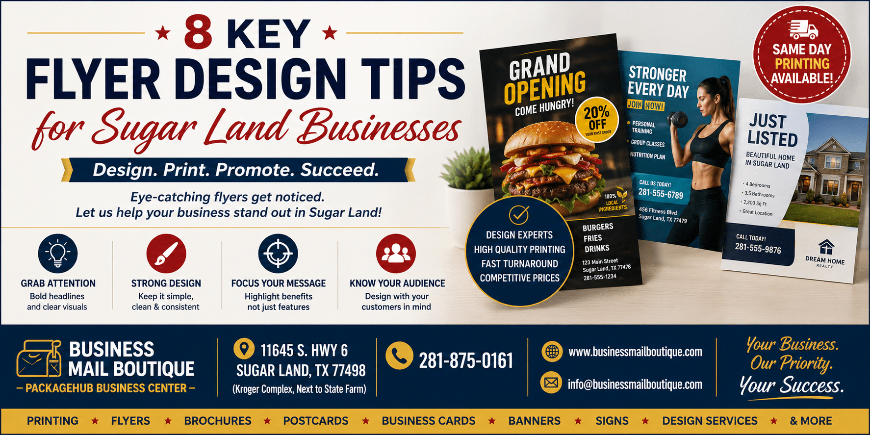
Turn Your Flyers Into Customers in Sugar Land
In a city as active as Sugar Land, why do so many flyers still look like they were made to be ignored? A lot of businesses assume distribution is the problem, when design is usually the underlying issue. If the message is buried, the visuals are weak, or the next step isn’t obvious, even a good offer gets overlooked.
That matters because print still earns attention in ways digital often doesn’t. Flyers hold audience attention 118% longer than digital advertising, and printed ads generate 29% more brand recall, according to NextDayFlyers’ flyer statistics roundup. For local businesses in Sugar Land, that creates a real opportunity. A well-made flyer handed out near neighborhood retail centers, included in in-store bags, or posted at community touchpoints can keep working long after someone first picks it up.
This guide focuses on practical flyer design tips that fit local realities. That means fast turnaround, in-person edits, print-ready files, and distribution choices that make sense for nearby customers instead of broad, generic campaigns. If you’re building a promotion for shipping services, mailbox rentals, notary work, events, or same-day printing, the details below will help you make the piece stronger before it ever goes to press.
If you need help assembling supporting visuals before you print, PhotoMaxi’s guide to graphic assets is a useful starting point.
Table of Contents
- 1. Clear Visual Hierarchy and Call-to-Action
- 2. High-Quality Imagery and Professional Photography
- 3. Strategic Use of Color Psychology and Brand Consistency
- 4. Compelling Copywriting and Benefit-Focused Messaging
- 5. White Space, Typography and Uncluttered Layout
- 6. Mobile-Friendly Design and QR Code Integration
- 7. Targeted Segmentation and Multiple Flyer Versions
- 8. Trusted Contact Information, Social Proof, and Local Credibility Signals
- 8-Point Flyer Design Comparison
- Your Next Great Flyer Starts Here in Sugar Land
1. Clear Visual Hierarchy and Call-to-Action
What should a customer notice in the first three seconds?
If your flyer cannot answer that fast, it will struggle on a counter, community board, mailbox drop, or handout at a local event in Sugar Land. Good hierarchy gives the page a reading order. Headline first, offer second, action third.
For a local print, shipping, or mailbox business, that often means leading with one clear promise such as “Same-Day Flyer Printing,” “Mailbox Rentals With a Real Street Address,” or “Pack and Ship With Confidence.” Then give the reader one next step. Call, visit, or scan. Keep it to one primary action so the page does not split attention.
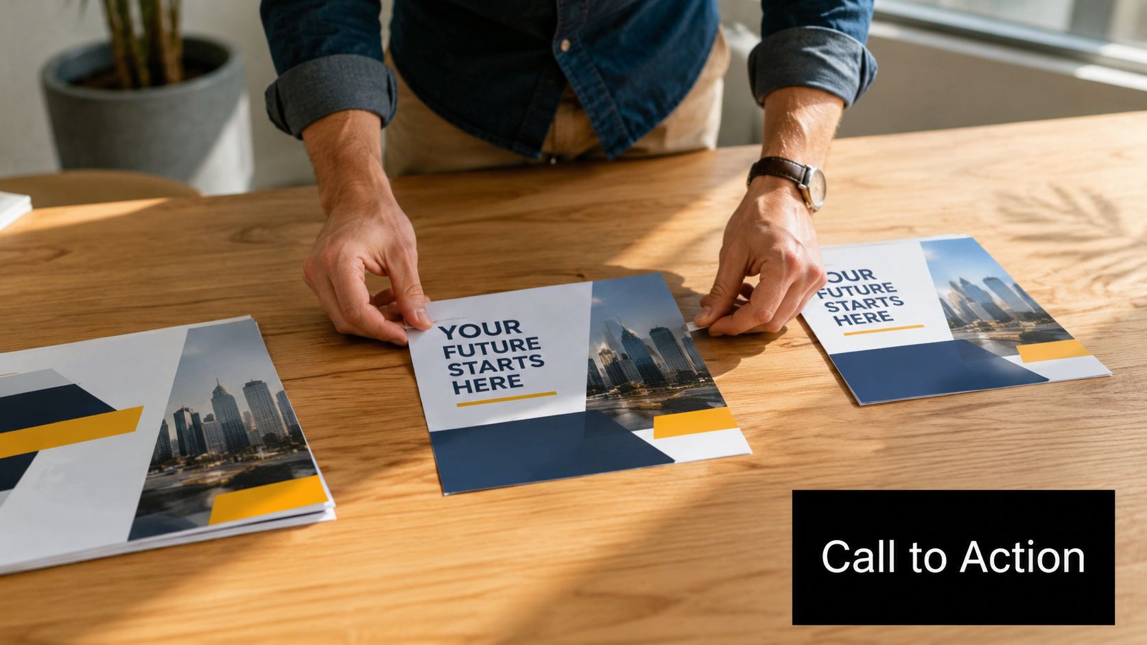
Lead the eye with a clear order
A flyer works best when the layout tells the reader where to look. The biggest element should carry the main offer. Supporting details should sit below it or beside it in smaller type. The CTA should stand apart through contrast, spacing, or a boxed area.
I usually advise Sugar Land businesses to choose one front-side priority. A shipping store should not give equal space to packing supplies, faxing, printing, passport photos, and mailbox rentals. Put the service you want to sell most at the top. Move secondary services lower on the page, or place them on the back if you are printing two-sided.
Practical rule: If someone glances at your flyer while walking into a store, they should still know what you offer and what to do next.
If you use AI tools to draft layout ideas before sending files to print, this guide to AI graphic design platforms can help you compare options. Just make sure the final file is cleaned up for print, with one obvious focal point and no clutter competing for attention.
Build a CTA that fits how local customers respond
A strong call-to-action is specific and easy to act on. “Contact us” is vague. “Visit our Sugar Land store today,” “Call for mailbox availability,” or “Scan for store hours and directions” gives people a clear next move.
These CTA patterns hold up well in print:
- Choose one main action: one phone number, one QR code, or one in-store visit prompt
- Place contact details where people expect them: top banner, bottom strip, or a dedicated footer block
- Use visual contrast: a colored box, bold button-style shape, or clean block of white space around the CTA
- Match the action to the offer: same-day printing should ask for an immediate response, while mailbox rentals should prompt an inquiry or availability check
This matters even more when your turnaround is fast. If a Sugar Land shop can revise artwork in the morning and print by the afternoon, the flyer should push immediate response. That is often the difference between a piece that builds recognition and one that brings in walk-ins this week.
2. High-Quality Imagery and Professional Photography
What do customers notice first when your flyer lands in their hand. Usually, it is the image.
For Sugar Land small businesses, that first visual cue carries a lot of weight. A dark phone snapshot, a stretched logo, or a generic stock photo can make a solid business look less established than it is. Strong imagery does the opposite. It gives people a quick read on your standards before they get to the headline.
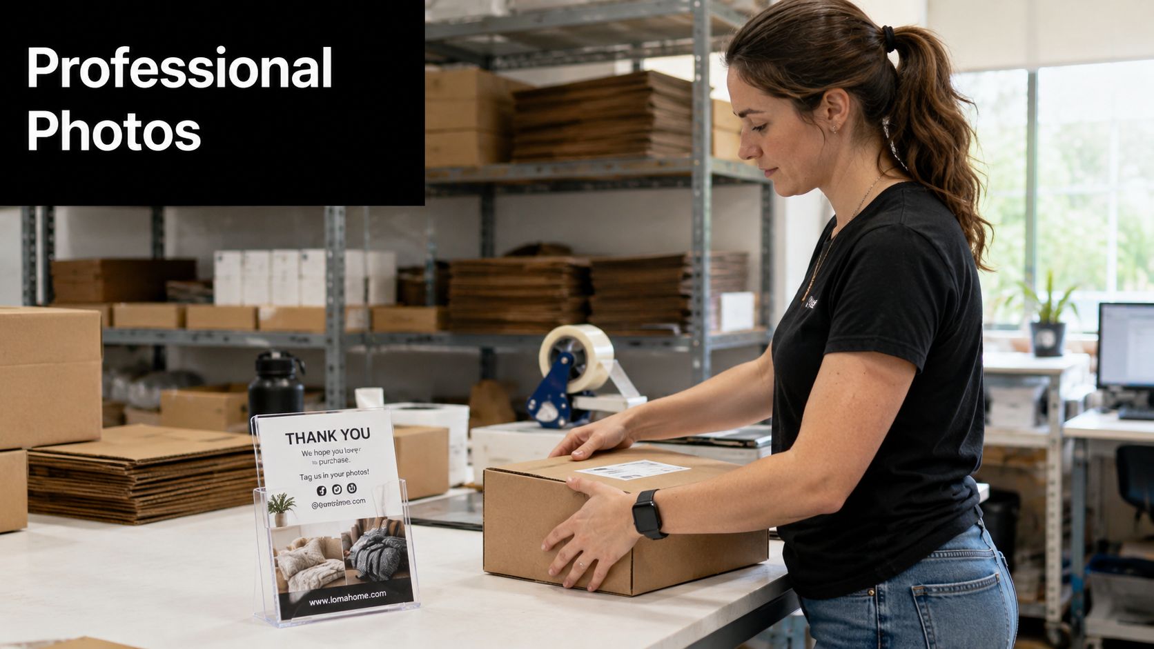
Show the real service, not a generic idea
Use photos that match what a customer will see when they visit, call, or buy. If you run a shipping business, show packed boxes, labeled parcels, and a clean service counter. If you sell print services, show finished flyers, business cards, banners, or yard signs with good lighting and sharp detail. If you offer mailbox rentals, feature the mailbox wall, storefront, and front desk.
That level of specificity builds trust faster than a polished but unrelated image. I have seen local flyers improve by swapping out abstract visuals for real photos of the shop, team, or finished work. A Sugar Land realtor should show the listing or neighborhood. A bakery should show the actual product in the case. A home service company should show the crew and completed job, not a model home from a stock library.
Print exposes image problems fast. Files that look acceptable on a phone screen often come out soft, noisy, or pixelated on paper. Before you send artwork to print, use high-resolution images, crop carefully, and check faces, product edges, and text inside the photo at full size. If a piece needs same-day or next-day production at Business Mail Boutique, those checks matter even more because there is less time to fix weak artwork after proofing starts.
Use stock images with restraint
Stock photography still has a place. It works for secondary backgrounds, seasonal accents, or early mockups while you are building the layout. The lead image should usually be your actual business, product, or staff in action.
If you want faster ways to test visual concepts before production, this guide to AI graphic design platforms can help with draft ideas and supporting assets. Just do not let AI or stock visuals replace actual proof that your business is local, active, and ready to serve.
Here’s a useful video reference before you finalize a print-ready layout:
One practical rule holds up well in local distribution. Flyers left at counters, handed out at community events, or posted on neighborhood boards tend to perform better when the imagery feels familiar and believable. Clean, well-shot photos usually beat flashy concepts for Sugar Land audiences.
3. Strategic Use of Color Psychology and Brand Consistency
What should a customer feel the moment your flyer hits their hand in Sugar Land. Trust, urgency, excitement, calm? Color sets that tone before they read a single line, and it also signals whether the piece clearly belongs to your business.
Brand consistency matters more in local marketing than many owners expect. A customer might see your storefront sign on Highway 6, your flyer at a coffee shop counter, and your promo handout at a school or community event in the same week. If each piece uses a different palette, recognition drops. If the colors match across print, signage, and in-store materials, your business looks established and easier to remember.
Choose color based on the offer and the audience
Color should fit the service, the promotion, and the way the flyer will be distributed. Blue, navy, charcoal, and clean neutrals usually work well for businesses that need to project reliability, such as notaries, mailbox providers, financial services, legal support, and shipping. Warmer accents like orange, red, or yellow can help draw attention to a deadline, coupon, grand opening, or seasonal special.
The trade-off is simple. Loud colors get noticed faster, but they can also make a flyer feel cheap if everything is competing for attention. A restrained palette often feels more credible, especially for established local businesses. For Sugar Land retail promos, event flyers, and restaurant specials, a brighter accent can make sense. For service businesses, restraint usually wins.
Color should direct attention, not scatter it.
Keep the palette tight and repeatable
A practical system is enough for most small businesses. Use one primary brand color, one supporting color, and one accent color for response points such as a phone number, offer badge, or QR code prompt.
That approach helps in two ways. First, the design stays clean. Second, reprints are easier. If you need a fast update at Business Mail Boutique, a stable color system makes file edits faster and reduces avoidable print surprises.
Use these rules:
- Assign one job to each color: Let your main color carry the brand, your secondary color support layout, and your accent handle action items.
- Match existing business materials: Pull from your storefront sign, logo, interior graphics, packaging, or business card design.
- Protect readability: Dark text on a light background still prints more reliably than low-contrast combinations.
- Limit accent overuse: If every box, headline, and icon is bright, nothing stands out.
- Handle seasonal versions carefully: Holiday colors can work if the flyer still looks like your company first.
One more print reality matters here. Colors on screen and colors on paper do not always match perfectly, especially with saturated reds, greens, and blues. For small businesses ordering short runs or rush jobs, it is smart to proof the key brand colors before approving a larger batch. That small step can save you from reprinting a flyer that looked right on your laptop but feels off in hand.
4. Compelling Copywriting and Benefit-Focused Messaging
A flyer isn’t a brochure. It doesn’t have room for rambling descriptions, industry jargon, or a complete service catalog on the front.
The strongest flyer copy gets to the customer’s problem fast, then answers it in plain language. That’s especially important for local services. People don’t want to decode what “document solutions” means. They want to know you can notarize a form, print a banner today, pack a fragile item safely, or give their business a real street address.
Write the benefit before the feature
Compare these two approaches:
- “Virtual mailbox rental available”
- “Get a real street address for your business”
The second one is stronger because it tells the reader why the service matters. The same rule applies to print and shipping. “Same-day business cards” is useful. “Launch your business faster with same-day business cards” is more persuasive because it connects the service to the customer’s goal.
A well-designed flyer should also stay concise. George Mason University’s visual identity guidance recommends keeping flyer content between 100 and 200 words, with headlines limited to 6 to 10 words for readability and impact, according to GMU’s flyer creation guide. That limit forces you to prioritize the message instead of stuffing in every detail.
Copy choices that usually perform better
When I review local flyer drafts, I see the same weak patterns over and over. Businesses lead with themselves instead of the customer, list features without context, or save the best point for the bottom.
Try these fixes:
- Open with the problem: “Need secure package handling?” or “Tired of using your home address for business?”
- State the outcome clearly: Faster printing, safer shipping, easier mail management, more professional presentation.
- Use direct verbs: Call, visit, scan, book, print, ship, reserve.
- Trim filler hard: If a sentence doesn’t help someone decide, cut it.
Best test: Read the flyer out loud. If it sounds like corporate copy, rewrite it until it sounds like something a real customer would respond to.
For local distribution, clarity beats cleverness. A resident grabbing coffee or running errands in Sugar Land isn’t reading for entertainment. They’re scanning for relevance.
5. White Space, Typography and Uncluttered Layout
How quickly can someone in Sugar Land understand your flyer while standing at a counter or walking out of a shop? If the answer is more than a few seconds, the layout needs work.
White space does more than make a flyer look polished. It directs attention. It gives the headline, offer, and contact details enough separation to be scanned in the order you intended. That matters for local businesses promoting several services at once. Printing, shipping, mailbox rental, notary, and passport photos can fit on one piece, but only if each service block has clear spacing and a defined place on the page.
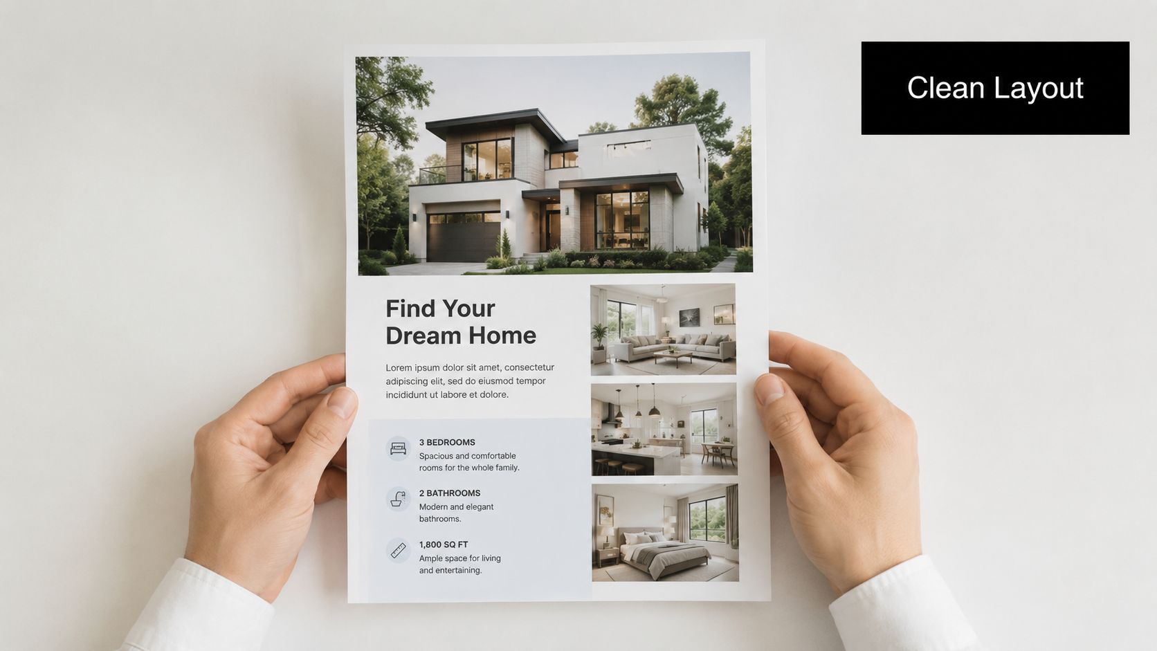
Simpler typography usually prints better
Use two fonts at most. One for headlines, one for body copy. Beyond that, the flyer starts to feel busy, especially on letter-size prints where every visual choice competes for limited space.
Sans-serif fonts usually hold up best for local promotional flyers. Helvetica, Arial, Open Sans, and Roboto stay readable at small sizes and reproduce cleanly on digital and offset presses. If the brand needs more personality, add it with size, weight, or color. Extra typefaces rarely improve the result.
Readability on paper matters as much as readability on screen. Keep strong contrast between text and background, avoid light gray body copy, and be careful with script fonts. They often look fine in a draft and fall apart once printed. The same caution applies if you plan to add a scannable element later. A clean layout gives that code room to work, which is one reason this QR code business card design guide translates well to flyer planning too.
Layout choices that hold up in print
At the print counter, I see the same layout problems repeatedly. They are easy to fix before the job goes to press:
- Too much on the front: Move secondary details, policies, or full service menus to the back.
- Every section boxed in: Use spacing and alignment first. Heavy borders make a flyer feel cramped.
- Photos or textures behind paragraphs: Put body copy on a solid background so people can read it fast.
- Long service lists in one block: Break them into short groups with clear labels.
- Margins pushed too tight: Leave room around the edges so the piece does not feel crowded after trimming.
There is a real trade-off here. Businesses often want to maximize every inch because print space costs money. In practice, overloaded flyers waste more money because they are harder to read and easier to ignore. A cleaner layout usually performs better, and it also gives your printer more flexibility if you need a fast turnaround in Sugar Land.
Before approving the full run, print one proof at actual size. Screen previews hide crowding. Paper does not.
White space is doing sales work. It helps the right details stand out.
6. Mobile-Friendly Design and QR Code Integration
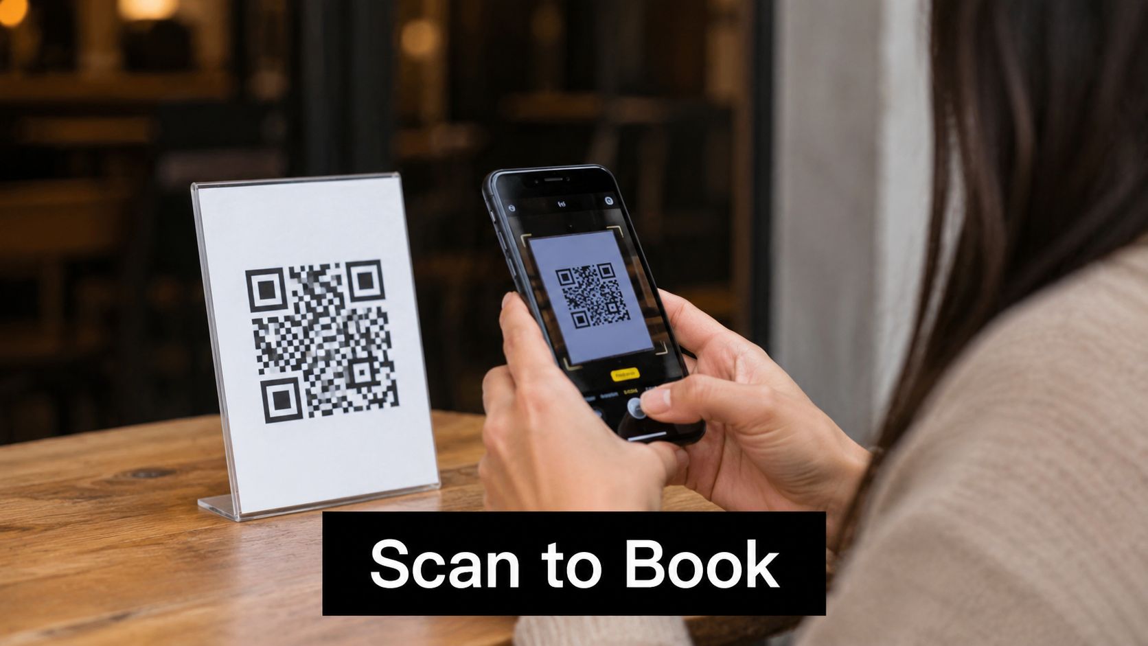
A printed flyer often ends on a phone. Someone sees the piece in a checkout area, takes it home, then scans it later for directions, booking, or pricing.
That handoff only works if the flyer is designed for quick scanning. If the QR code is too small, unlabeled, or buried in visual clutter, people ignore it. If the landing page isn’t mobile-friendly, the flyer did its job and the next step failed.
Make the scan feel worth it
Don’t drop a QR code onto the page without context. Tell people exactly what they’ll get. “Scan for store hours,” “Scan for mailbox options,” or “Scan for print pricing” gives the code a reason to exist.
For local businesses, map links are especially effective because they remove friction. A Sugar Land customer doesn’t have to remember the address or search manually. One scan can send them straight to the storefront or the service page.
If you want a practical example of connecting print to digital more effectively, this QR code business card design guide shows how to build a cleaner bridge between physical marketing and mobile action.
Design for the real conditions of use
People scan flyers in cars, lobbies, counters, and low-light interiors. That means reliability matters more than visual novelty.
A few habits help:
- Use strong contrast: Dark code on a light background scans more reliably.
- Leave room around the code: Crowded edges create scanning problems.
- Send people to one clear page: Don’t make them hunt once they land.
- Test before printing: Scan from different phones before approving the run.
This is one of the easiest flyer design tips to get right, and one of the easiest to mishandle through small design mistakes. Treat the QR code as a functional tool, not just a design accessory.
7. Targeted Segmentation and Multiple Flyer Versions
One flyer for everyone usually speaks clearly to no one. A business owner, an e-commerce seller, and a walk-in shipping customer may all use the same store, but they care about different benefits.
That’s why multiple flyer versions often outperform one general piece. Not because the design is more complicated, but because the message feels more relevant the moment someone sees it. A segment-specific headline does more work than a broad headline ever will.
Match the offer to the audience
A mailbox flyer aimed at entrepreneurs should talk about professional presence, privacy, and a real street address. A flyer for e-commerce sellers should highlight packing support, shipping convenience, and repeat drop-off ease. A print-focused flyer for local events should lead with fast turnaround and finished products like banners, posters, and handouts.
The local print advantage is speed. If you can produce small targeted batches quickly, you don’t have to commit to one oversized generic run. A neighborhood business can print one version for nearby retail distribution, another for local B2B outreach, and another for in-store handouts.
Different audiences don’t need different branding. They need different emphasis.
Print smaller batches, learn faster
This approach works especially well when same-day or quick-turn printing is available. You can test a flyer promoting mailbox rentals to startups, then compare it with one promoting print services to event organizers and nonprofits. The design framework can stay similar while the headline, image, featured service, and CTA shift.
For businesses that want fast local production, same-day flyer printing in Sugar Land makes it easier to test versions without waiting through a long production cycle.
Practical segments for Sugar Land often include:
- Small business owners: Mailbox, printing, shipping, notary support
- E-commerce sellers: Packing, drop-offs, returns, label handling
- Entrepreneurs: Street-address mailbox and professional presence
- Community event organizers: Flyers, posters, signs, and quick reprints
Generic messaging feels safe, but it usually underperforms. Specificity is what gets attention.
8. Trusted Contact Information, Social Proof, and Local Credibility Signals
A flyer can look sharp and still fail if it doesn’t answer the trust question. Readers want to know who you are, where you are, and why they should believe you’ll deliver.
That’s especially true for service businesses. If someone is handing over important documents, shipping valuable items, ordering print materials for an event, or using your address for business mail, trust isn’t a bonus. It’s the sale.
Make credibility visible
Contact information should never feel hidden. Put the business name, phone number, website, and physical location where they’re easy to find. If walk-ins are welcome, say so. If you serve Sugar Land directly, say that too.
Credentials also matter. Authorized shipping status, notary availability, mailbox services with a real street address, and in-house printing all reduce hesitation because they signal capability. A local customer deciding between options often chooses the business that looks established and convenient at the same time.
The same goes for folded formats. Marq notes that different folded finishes can create a unique impact and lasting impression, and the source also cites a projection of a 37% increase in folded flyer orders among small businesses for 2025 to 2026, along with print setup guidance such as 0.125 in bleed and 0.25 in safe margins in the Marq flyer guide. If you use folded layouts to carry more services and credibility details, make sure the structure still protects readability.
The local touches that help people act
Trust signals don’t have to be dramatic. They just need to be relevant.
- Use recognizable service identifiers: Authorized carrier references and in-store service categories help people understand what you handle.
- Show real location details: Sugar Land address, hours, and easy contact options reduce uncertainty.
- Include selective proof: One short testimonial or a polished review excerpt can help if it’s real and current.
- Support premium perception with material choices: GraphicMama advises designers to test each design on different paper types to achieve the intended effect, and the source notes that paper thickness can influence readability and perceived value in print, as discussed in GraphicMama’s flyer design tips.
When you’re printing pieces meant to represent your business in person, paper choice isn’t a side issue. It’s part of the credibility package.
For businesses that also want matching leave-behinds at the counter, same-day business cards in Sugar Land can reinforce the same trust signals across print pieces.
8-Point Flyer Design Comparison
| Item | ? Implementation Complexity | ⚡ Resource Requirements | ⭐ Expected Outcomes | ? Ideal Use Cases | ? Key Advantages |
|---|---|---|---|---|---|
| Clear Visual Hierarchy and Call-to-Action | Moderate, requires design skill and testing | Low–Moderate: designer time, print proofs | High ⭐⭐⭐⭐, better engagement and conversions | Storefront promos, multi-service flyers, CTAs | Guides action; reduces confusion; improves recall |
| High-Quality Imagery and Professional Photography | Moderate, needs photo shoot or curated stock | High: professional photographer, editing, file prep | Very High ⭐⭐⭐⭐⭐, builds trust and visual appeal | Showcasing equipment, finished products, team | Visual credibility; higher engagement; authentic proof |
| Strategic Use of Color Psychology and Brand Consistency | Low, design decision plus testing for contrast | Low: palette setup; possible higher print cost | High ⭐⭐⭐⭐, stronger recognition and trust | Brand identity, promotions, service differentiation | Strong identity at low recurring cost; highlights CTAs |
| Compelling Copywriting and Benefit-Focused Messaging | Low–Moderate, requires audience insight and editing | Low: copywriter time, A/B testing | Very High ⭐⭐⭐⭐⭐, boosts response rates and clarity | Promotional headlines, benefit-driven CTAs, multi-service explanations | Drives conversions; creates emotional connection; fast to implement |
| White Space, Typography and Uncluttered Layout | Moderate, needs design restraint and typographic choices | Low–Moderate: designer time, print proofs | High ⭐⭐⭐⭐, improves readability and perceived quality | Premium brands, multi-service layouts, informational flyers | Enhances readability; uncluttered appearance; emphasizes key info |
| Mobile-Friendly Design and QR Code Integration | Low, add QR + ensure mobile landing pages | Low–Moderate: QR creation, landing pages, tracking | High ⭐⭐⭐⭐, measurable engagement; bridges channels | Promotions, bookings, directions, tracking links | Reduces friction; trackable; links physical to digital |
| Targeted Segmentation and Multiple Flyer Versions | High, requires segmentation, multiple creatives | High: several designs, printing runs, targeted distribution | Very High ⭐⭐⭐⭐⭐, higher response and improved ROI | Diverse audiences (e‑commerce, small biz, entrepreneurs) | Personalized messaging; better conversion; testable results |
| Trusted Contact Info, Social Proof & Local Credibility | Low–Moderate, collect and maintain testimonials/credentials | Low–Moderate: review management, design placement | High ⭐⭐⭐⭐, increases trust and conversion | Local marketing, new-customer acquisition, B2B trust-building | Reduces perceived risk; validates services; strengthens local trust |
Your Next Great Flyer Starts Here in Sugar Land
Effective flyer design isn’t about artistic genius. It’s about making smart choices that help the right person notice your offer, understand it quickly, and take the next step without friction.
That starts with hierarchy. A flyer should tell the eye where to go first. Your headline, main visual, and call-to-action need to work together instead of competing for space. When those basics are handled well, even a simple one-page handout can do real sales work for a local business.
It also comes down to discipline. Good flyers don’t try to say everything. They use concise copy, a controlled color palette, readable typography, and images that support the service instead of distracting from it. For Sugar Land businesses, that often means showing their storefront, available products, and service categories customers can use today.
The local angle matters too. A flyer handed out in the community has to fit the way local customers behave. They scan quickly. They want clear hours, location, and a reason to trust you. They may keep the flyer for later, then pull out their phone and act only if the design makes that next step easy. That’s why QR placement, contact clarity, and audience-specific versions can make such a big difference.
Print execution matters just as much as design. Paper stock, image sharpness, folds, margins, and proofing can either strengthen the message or weaken it. A flyer that looks polished in a digital mockup can still disappoint if it’s printed on the wrong stock or packed too tightly for the chosen format. Getting local feedback before a full run saves money and usually leads to a better final piece.
If you’re ready to move from ideas to a finished product, Business Mail Boutique LLC gives Sugar Land businesses a practical local partner. You can get design input, quick revisions, and printing support without sending files into a faceless queue and hoping for the best. That’s especially useful when you need a same-day turnaround, want to compare paper options in person, or need matching materials like business cards, signs, or postcards.
The strongest flyer design tips are the ones you can use. Keep the message focused, the layout clean, the visuals credible, and the next step obvious. Then print with a shop that understands how local businesses need to move. Walk-ins are always welcome.
If your business needs flyers that look polished and get into customers’ hands fast, Business Mail Boutique LLC can help with design feedback, same-day printing, paper stock options, and in-store guidance suited for Sugar Land businesses. Whether you’re promoting shipping, printing, mailbox rentals, notary services, or an upcoming event, the team can help you turn a draft into a flyer that’s ready to work.

Related posts

Custom Memorial Glasses Engraved in Three Hours in Sugar Land
When a customer needed eight personalized glasses for a memorial, Business Mail Boutique completed the engraving or...

Custom Martini Glass Engraving in Sugar Land, TX
Custom Logo Engraving on Martini Glasses in Sugar Land, Texas.
Business Mail Boutique recently completed a beautiful custom engravin...

Custom Engraved Wine Glasses for a Golf Club Event in Sugar Land, TX
Custom Engraved Wine Glasses for a Golf Club Event in Sugar Land.
Custom wine glass engraving in Sugar Land, TX at Business Mail Bouti...