
- Print Business Cards in Sugar Land – Same Day Service
- Copying Services
- Document Printing, Finishing & Lamination in Sugar Land
- Flyers
- Print Banner in Sugar Land | Same-Day Banner Printing Near Me
- Graphic Design
- Photo Printing
- Postcard Printing
- Document Printing
- EDDM Full Service Postcards
- FotoZoomer Large Format Printing


QR Code Business Card Design: A Practical How-To Guide
11645 S. Hwy 6, Sugar land, Texas 77498, United States (US) - Phone: 281-875-0161 Email: info@businessmailboutique.com
Route
You’ve got a card design open, a QR code generator in another tab, and one nagging question in the back of your mind. Will this thing scan once it’s printed?
That’s the part most online advice skips. Making a QR code is easy. Printing a QR code business card design that works reliably in a bright lobby, a dim restaurant, or a busy trade show line takes more care. Small mistakes in size, finish, contrast, or file export can turn a sharp-looking card into a wasted print run.
Good QR cards aren’t just digital tools squeezed onto paper. They’re print products with tight physical limits. If you handle those limits properly, the card feels modern, useful, and effortless to use. If you ignore them, people angle their phones at it twice, fail to scan, and move on.
Table of Contents
- Planning Your QR Code’s Purpose
- Generating a High-Quality QR Code
- Designing for Impact and Scannability
- The Pre-Print Check for Perfect Production
- Common QR Code Design Mistakes to Avoid
- Bringing Your QR Code Business Card to Life
Planning Your QR Code’s Purpose
The first decision isn’t where the QR code goes. It’s what happens after someone scans it.
A lot of first-time card buyers try to make one code do everything. They want it to open a website, show social links, save a phone number, book a meeting, and explain the business. That usually produces a cluttered experience and a weaker card. A QR code on a business card works best when it has one clear job.
Choose between a URL and a vCard
For most small businesses, the choice comes down to URL QR code versus vCard QR code.
A URL QR code sends people to a destination you control, such as a website, portfolio, booking page, menu, or landing page. This option works well when you need context, visuals, or multiple next steps. It’s a strong fit for service businesses, consultants, creatives, and restaurants.
A vCard QR code is more direct. It opens contact information on the phone and makes saving your details easier. That’s why it’s such a common format for networking. Industry guidance on business card QR codes notes that vCard use is a standard implementation pattern, especially when businesses want contact sharing first and can pair it with dynamic QR features for updates and scan analytics in the background (QR code business card guidance).
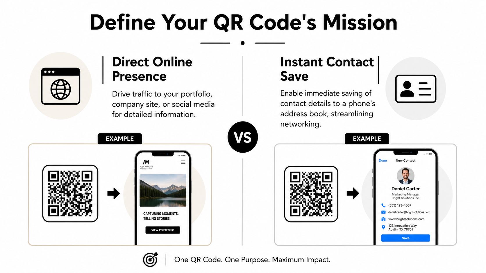
A simple way to decide:
- Use a URL QR code if you need to show work, explain services, display a menu, or direct traffic to one campaign page.
- Use a vCard QR code if the main goal is fast contact capture during networking.
- Use a URL that leads to a simple contact page if you want more control over branding and future edits.
Static or dynamic matters more than most people think
A key factor separating professional cards from throwaway ones is their adaptability. A static QR code is fixed. If you change your website path, job title, phone number, or destination page, you may need new cards.
A dynamic QR code gives you room to adjust after printing. That’s usually the smarter business choice because cards tend to outlive small business changes. If your phone number updates, your booking page changes, or you want to send scans to a seasonal offer later, a dynamic setup saves you from expensive reprints.
Practical rule: If you’re printing more than a very small test batch, don’t lock yourself into a code you can’t update.
That shift also reflects how digital cards are now used. One industry summary projects the global digital business card market at about $238 million by 2026, with 12.2% CAGR, and says 37% of businesses have adopted digital cards, up from 16% in 2020 (digital business card statistics). For a small business owner, the takeaway is simple. QR cards aren’t a gimmick anymore. They’re part of standard professional networking.
Keep the next step obvious
Before you move into design, write one sentence that finishes this phrase: “When someone scans my card, I want them to…”
That line will keep the project honest. If the answer is “save my contact info,” build for that. If it’s “see my work and request a quote,” build for that instead. A card with one strong post-scan action almost always performs better than a card trying to do five things at once.
Generating a High-Quality QR Code
Once the destination is set, the next job is producing a file that a printer can trust. Many QR code business card projects go off course at this stage. The code works on-screen, so people assume it’s production-ready. Often it isn’t.
A business card is tiny. Any softness, scaling artifact, or weak export setting gets exposed fast when ink hits paper.
Start with production-safe settings
The safest workflow is straightforward. Generate either a vCard or URL QR code, then export it as SVG or PNG at 300 DPI minimum. Guidance for printed QR business cards also recommends error correction level M, which provides 15% recovery capacity as a practical baseline for cards (business card QR production workflow).
That combination matters for a reason:
- SVG stays crisp when resized because it’s vector-based.
- PNG at 300 DPI minimum is acceptable when you need a raster file for a design program or quick proof.
- Error correction level M gives the code some resilience if printing, handling, or light design changes introduce minor imperfections.
Don’t build from a screenshot
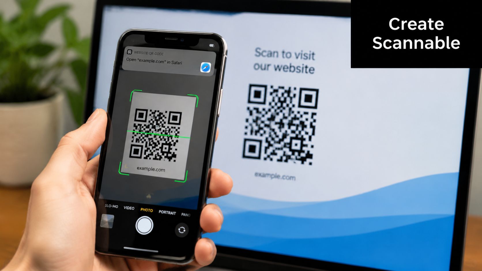
This mistake shows up all the time in print shops. Someone takes a screenshot of a QR code from a generator, drops it into Canva or Word, and sends it to print. The code may look sharp on a phone screen and still break down when reduced, compressed, or printed.
Use the actual export from the generator, not a screen capture. If the tool doesn’t let you download a proper file, pick another tool. That’s faster than reprinting cards.
A clean handoff to design software usually looks like this:
- Generate the final destination code.
- Export SVG first if the tool offers it.
- Keep a PNG at 300 DPI minimum as a backup.
- Name the file clearly so older versions don’t get mixed in.
- Place the file into your card layout without stretching it disproportionately.
Match the tool to the job
If you’re making one personal card, almost any decent QR generator can work if it allows proper export settings. If you’re producing cards for a team, event, or rotating staff, your workflow needs more structure. In that situation, tools that generate event QR codes from spreadsheets can save a lot of repetitive setup because they help standardize bulk creation before design starts.
A QR code file is not “done” when it opens the right page on your laptop. It’s done when it survives layout, export, print, and real-world scanning.
Keep the destination clean too
The printed code can be perfect and the experience can still fail if the landing page is messy. If you’re using a URL, keep the destination mobile-friendly, fast to understand, and easy to act on. If you’re using a vCard, check that the fields display correctly on a phone and don’t dump the user into a confusing page with too many options.
A good printed QR starts as a good file. It finishes as a good scan experience.
Designing for Impact and Scannability
The most important design rule is blunt. Scannability beats cleverness.
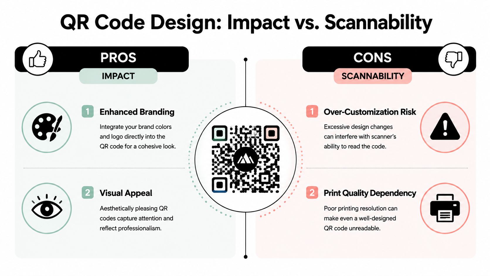
A QR code business card design can look polished, branded, and modern, but the code still has to read quickly. If a fancy treatment lowers scan reliability, it isn’t good design. It’s decoration getting in the way of the card’s job.
Size first, style second
Business cards don’t give you much room, so size discipline matters. Multiple industry guides recommend a minimum printed QR code size of about 2 cm × 2 cm, or roughly 0.8 × 0.8 inches, while some design guidance suggests aiming for around 1 inch × 1 inch or larger and then testing the printed card on multiple devices before production (QR code sizing guidance for business cards).
If space allows, larger is usually safer. The code should feel intentional, not squeezed into leftover space near the trim edge.
A practical layout check is this. If the QR code looks like an afterthought, it’s probably too small or too crowded.
Respect the quiet zone
The quiet zone is the empty space around the code. Scanners use that border to distinguish the code from the rest of the design. When logos, text, patterns, or color blocks press too close, scan performance drops.
This is one of the least glamorous and most important parts of print production. People often spend time adjusting fonts and icon spacing, then ignore the blank area the QR code needs to function.
Branding works when it stays disciplined
You can brand a QR code. You just can’t bully it.
Brand color, subtle framing, and careful logo use can work well. Heavy stylization, low contrast, custom shapes, and decorative interference usually don’t. The safest choice remains a dark code on a light background. Black on white is still the easiest combination to print and scan consistently.
If you want a more premium card feel, put your design energy into the layout, typography, stock, and finish. Let the code remain simple.
Production insight: The fanciest QR code in the proof file is often the first thing I’d simplify before print.
Smart placement on a small card
There isn’t one universal placement, but there are bad ones. Don’t place the code so close to the edge that trim variation threatens it. Don’t bury it under dense contact information. Don’t let it compete with your name and primary identity.
For most cards, these placements are dependable:
- Back of card, dominant element: Best when you want a clean front and one clear call to action.
- Front corner with breathing room: Works if the overall layout is minimal.
- Opposite the main contact block: Useful when the card needs both printed details and scan access.
Card stock also affects how the final design feels. If you’re considering heavier stocks for a more substantial hand feel, examples of thick business card options can help you judge how much visual density your design can carry before it starts feeling cramped.
Add a label so humans know what to do
A QR code without context can stall people. Label it. “Scan to save contact.” “Scan to view portfolio.” “Scan for menu.” A short instruction lowers hesitation and improves usability without changing the code itself.
That tiny line also helps accessibility because it explains the purpose before the scan happens. The code should be readable by a camera, but the card should also be understandable by a person in a hurry.
The Pre-Print Check for Perfect Production
This is the checkpoint that saves money.
Most failed QR code business cards don’t fail because the link was wrong. They fail because nobody tested the printed piece under normal conditions before approving the run. A screen preview is useful, but it won’t show glare, muddy ink, stock texture, or how the code behaves at actual card size in someone’s hand.
Print a real proof at final size
For business cards, small changes matter more than people expect. A code that scans nicely on a monitor can become unreliable once it’s reduced, exported through a print workflow, or placed on glossy stock.
Neutral design guidance recommends keeping the QR code at least 2 × 2 cm and warns that glossy or reflective finishes can reduce scan success, making matte stock or a non-glare finish a safer option for high-volume distribution (Avery QR code business card guidance).
That matches what print shops see in practice. Gloss can look attractive under office lighting and turn into a mirror under event lighting. Phones then struggle to focus or separate the code from reflected hotspots.
Test like a printer, not like a designer
When you run your proof, test the physical card the way people will use it.
Use this checklist:
- Scan from the printed proof: Don’t stop at the PDF or design mockup.
- Try multiple phones: Test on both iPhone and Android if you can.
- Change the light: Bright office light, window light, and lower indoor light can produce different results.
- Hold the card naturally: A card shouldn’t require perfect angles or a still hand to work.
- Check the destination: Make sure the code opens the right page and that the page itself is usable on a phone.
If your files are coming from different tools or multiple team members, it helps to review a guide on how to prepare your files for print before you send them out. The biggest printing delays often come from avoidable setup issues, not from the press itself.
Watch the quiet production details
Proofing isn’t only about the code. It’s also about everything around it.
A few practical checks make a big difference:
| Check | Why it matters |
|---|---|
| Code placement away from trim | Prevents crop variation from clipping important edges |
| High contrast in final print file | Avoids muddy output from overdesigned color choices |
| Stock finish review | Reduces glare-related scan failures |
| Final-size proof | Confirms the code still reads at actual dimensions |
If the first printed sample scans only when you hold it under ideal light, that’s not a pass. That’s a warning.
For layout setup, trim, and safe-area concerns, a business card printing template is useful because it keeps the QR code, text, and visual margins from drifting into risky areas during production.
Approve only after the awkward tests
The best proofing habit is simple. Try to break the card before you approve it.
Scan it under poor light. Tilt it. Hand it to someone else without explanation. Use an older phone if one is available. If the card still works comfortably, you’re in good shape. If it needs a perfect camera, perfect light, and a patient user, fix the design now while the cost is still small.
Common QR Code Design Mistakes to Avoid
Most QR card failures fall into a few predictable groups. The good news is that they’re easy to avoid once you know what to look for.
Technical mistakes
The first category is physical production error. The code is too small, too soft, or too crowded by surrounding design elements. These problems usually come from shrinking the QR at the end of the layout process instead of designing around it from the start.
The fix is disciplined setup. Keep the code large enough to scan comfortably, preserve empty space around it, and use a clean export file rather than a screenshot or compressed image.
Visual mistakes
The second category is overdesign. People invert colors, put light codes on dark fields, use low-contrast brand palettes, or place the code over texture and photography. It may look sleek in a mockup and scan poorly in practice.
Use a dark code on a light background whenever possible. If you customize the code, make only modest changes and proof it on paper before committing to quantity.
A QR code doesn’t need to look exciting. The card around it can do that job.
Human-use mistakes
The third category gets less attention. The code may be technically valid and still hard to use because nobody knows what it does or where it leads.
Accessibility guidance around QR business cards points to a better standard: design for both human readability and machine readability by clearly labeling the code, keeping the landing page simple, and preserving contrast so the card works in low light and varied real-world conditions (accessible QR code business card design guidance).
A few easy fixes help:
- Add a short instruction: Tell people what scanning will do.
- Provide a fallback: Include printed contact details or a readable web address.
- Keep the destination simple: Don’t send a mobile user to a cluttered page.
- Think beyond ideal conditions: Cards should still work at events, counters, lobbies, and trade booths.
The best QR card doesn’t force people to guess. It guides them cleanly from print to action.
Bringing Your QR Code Business Card to Life
A good QR card comes together in three parts. The destination has to be useful. The printed code has to be technically sound. The final card has to survive real-world handling, lighting, and scanning.
That’s why QR code business card design is less about novelty and more about discipline. Small details decide whether the card feels polished or frustrating.
If you’ve done the planning, generated a clean file, sized the code properly, and tested a printed proof, you’re already ahead of most first runs. At that point, the remaining job is production. The printer needs to preserve the integrity of the file and deliver a card that still scans after the design leaves your screen.
When you’re ready to move from mockup to finished piece, it helps to work from a service that already handles business card printing as a real production process, not just a generic upload form.
One more visual walkthrough can help if you’re finalizing your layout and proofing decisions:
The best result is simple. Someone takes your card, scans once, gets exactly what they expected, and remembers your business for the right reasons.
Business Mail Boutique LLC helps local businesses and professionals turn good card designs into print-ready, polished finished pieces. If you’re in Sugar Land and want same-day help with QR code business cards, proofs, templates, or final printing, visit Business Mail Boutique LLC for practical guidance and fast turnaround.

Related posts

Custom Memorial Glasses Engraved in Three Hours in Sugar Land
When a customer needed eight personalized glasses for a memorial, Business Mail Boutique completed the engraving or...

Custom Martini Glass Engraving in Sugar Land, TX
Custom Logo Engraving on Martini Glasses in Sugar Land, Texas.
Business Mail Boutique recently completed a beautiful custom engravin...

Custom Engraved Wine Glasses for a Golf Club Event in Sugar Land, TX
Custom Engraved Wine Glasses for a Golf Club Event in Sugar Land.
Custom wine glass engraving in Sugar Land, TX at Business Mail Bouti...