
- Print Business Cards in Sugar Land – Same Day Service
- Copying Services
- Document Printing, Finishing & Lamination in Sugar Land
- Flyers
- Print Banner in Sugar Land | Same-Day Banner Printing Near Me
- Graphic Design
- Photo Printing
- Postcard Printing
- Document Printing
- EDDM Full Service Postcards
- FotoZoomer Large Format Printing


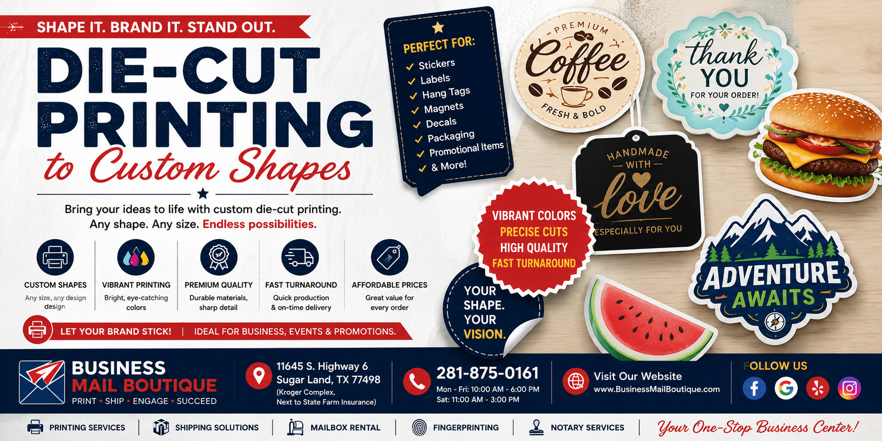
Die Cut Printing to Custom Shapes
Learn how die cut printing creates unique stickers, labels, and packaging. Our guide covers file prep, materials, and tips for small businesses to get started.
Businessmailboutique
11645 S. Hwy 6
Sugar land, Texas 77498 United States (US)
Email: info@businessmailboutique.com
Route
You’re probably looking at a logo, label, sticker, or package mockup and thinking one thing: it would look a lot better if it weren’t trapped in a plain rectangle.
That’s exactly where die cut printing earns its keep. A custom shape can make a simple sticker feel retail-ready, turn a tag into part of the brand, and give packaging a more polished finish without changing the artwork itself. For a small business, that matters. Shelf appeal, presentation, and first impressions often come down to details like shape, edge quality, and how the printed piece feels in someone’s hand.
Short runs add another layer to the decision. You don’t just want something that looks good. You want something that fits the budget, works with your file, and doesn’t create production problems after the job starts. That’s where a little technical clarity saves a lot of hassle.
What Is Die Cut Printing and How Does It Work
Die cut printing works a lot like using a cookie cutter in dough. Instead of cutting a star or flower out of dough, a shaped blade cuts your printed piece out of paper, vinyl, cardstock, or label stock.
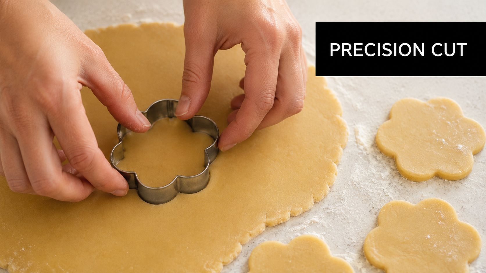
The “die” is the tool that makes that shape happen. In traditional die cutting, it’s a custom metal rule set into a base, and it presses into the printed material to cut the shape cleanly. That’s why circles, rounded logos, bottle-neck tags, custom decals, and shaped product labels all come out looking consistent from piece to piece.
Why shape matters more than most owners expect
A custom shape changes how people handle and remember a printed item. A sticker cut to your mascot, a hang tag shaped like your product, or a label that follows the contour of a jar does more than look nice. It makes the piece feel intentional.
That matters in a crowded market. The global die-cutting service market was valued at approximately USD 2 billion in 2023 and is projected to grow at around 3.8% CAGR from 2024 through 2032, driven by demand for customized packaging, according to die-cutting service market analysis from GM Insights. Small brands feel that same pressure every day. If your packaging and promo materials look generic, they blend in.
For businesses using stickers as low-cost brand assets, it also helps to see how shape and durability work together. This guide to durable vinyl stickers for branding is useful because it connects material choice to real-world use, not just artwork.
Practical rule: If the shape supports the brand, the print feels custom. If the shape fights the artwork, the job looks gimmicky.
What actually happens in production
The process usually follows a simple path:
- Artwork is printed first. The design goes on the sheet or roll before cutting.
- A cut path is defined. That path tells the equipment exactly where the final edge belongs.
- The material is cut to shape. The die follows the path and removes the excess.
- The finished piece is separated, weeded, or stripped. That leaves the final sticker, tag, label, or package component.
Standard straight trimming is fine for basic flyers. Die cut printing is for jobs where the shape is part of the finished product. That includes stickers, decals, labels, tags, folders, shaped cards, and packaging components.
Die Cut vs Kiss Cut Choosing the Right Style
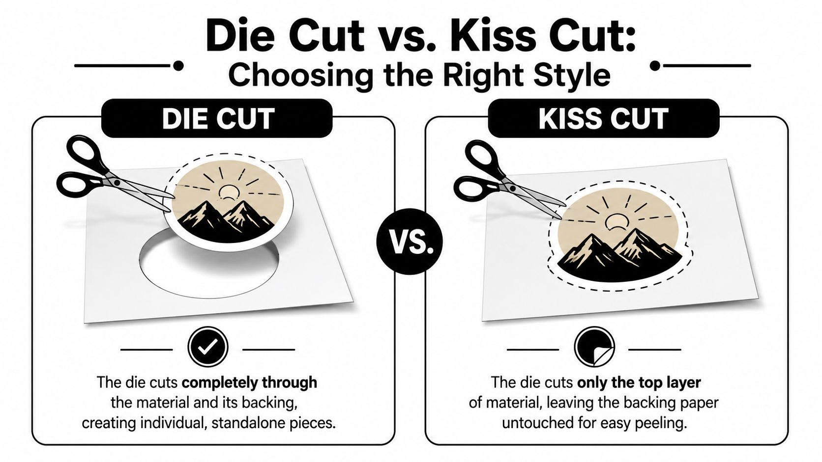
A lot of customers ask for die cut stickers when they want kiss cut sheets, or the other way around. The artwork can be the same. The difference is in how the material gets cut and how the final piece is handed to the customer.
How the cut actually differs
A die cut, also called a through-cut, goes through both the printed material and the backing. You end up with an individual piece in the final shape. If your logo is shaped like a coffee cup, the whole sticker becomes that coffee cup outline.
A kiss cut only cuts the top layer and leaves the backing sheet intact. The sticker peels off the backing, but the sheet itself stays rectangular or otherwise easier to handle.
Here’s the cleanest comparison.
| Feature | Die Cut (Through-Cut) | Kiss Cut |
|---|---|---|
| Final form | Individual shaped piece | Sticker remains on backing |
| Backing | Cut through with the sticker | Stays intact |
| Best for | Handouts, package inserts, event giveaways | Sticker sheets, sets, retail-friendly peel-off format |
| Look and feel | Standalone and polished | Easy to peel and organize |
| Common use | Single logo sticker or decal | Multiple designs on one sheet |
A quick way to choose
If you want to hand someone one sticker at a market booth, include one in an order box, or use a shaped decal as a branded freebie, die cut is usually the right call. It feels like a finished object.
If you’re selling a themed sticker set, offering multiple icons on one backing sheet, or you want easier handling for small peel-off labels, kiss cut tends to work better.
A die cut piece is better when the shape itself is the product. A kiss cut sheet is better when peelability and organization matter more than the outer edge.
A few practical examples help:
- Coffee shop logo giveaway: Use die cut so each sticker feels gift-ready.
- Planner sticker pack: Use kiss cut so customers can peel individual icons off a sheet.
- Brand insert for shipped orders: Use die cut for a cleaner presentation.
- Product label sheet for manual application: Use kiss cut if the staff needs easy peeling from a backing sheet.
There’s also a handling trade-off. Small or intricate shapes can be harder to peel if they’re fully through-cut and tiny. In those cases, kiss cut can make the item more user-friendly even if the shape is still custom.
Another point people miss is display. If the item is going into retail packaging or being sold as a set, kiss cut often looks more organized. If it’s meant to be passed around one at a time, die cut usually wins.
Preparing Your Design File for Flawless Die Cutting
A small business owner sends over a sticker file that looks perfect on a laptop. Then the finished pieces arrive with a sliver of white on one side, a border that looks off-center, or a sharp point that lifts after cutting. That usually comes back to file setup, not printing quality.
For short runs, file prep matters even more. Large online printers may batch jobs and auto-correct what they can. A local shop like Business Mail Boutique is usually looking at your actual shape, your material, and how to get a clean result without building unnecessary cost into a small order.
Start with the cut line
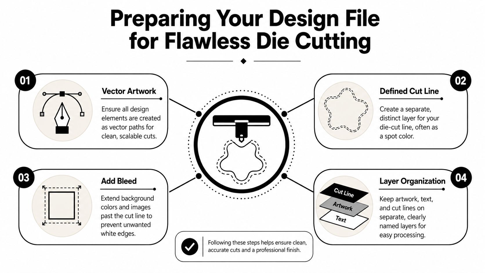
The dieline is the path that tells us where the knife cuts. It works like a cookie cutter. If that path is messy, the final piece looks messy, even when the print itself is sharp.
Keep the dieline on its own layer and label it clearly. If the job includes more than one finishing action, name each one plainly so production does not have to guess.
Your file should usually include:
- Artwork layer: the printed design
- Dieline layer: the vector cut path
- Separate labels for other actions: such as Score or Perf, if the piece folds or tears off
Blue Label Packaging explains the production side well in its guide to die cutting rule types and dieline setup. Clear naming saves time in prepress and cuts down on avoidable questions before a short-run job can go on press.
If you are ordering stickers and want to compare your file against a live product spec, the setup notes on our custom sticker printing page can help.
File rules that keep the cut clean
A good die cut file is usually simple, but it needs discipline. These are the four checks that prevent the problems we see most often at local-shop quantities.
- Build the cut path as a vector
Use AI, EPS, or a press-ready PDF with a true vector cut line. Raster edges can look fine on screen and still create rough or uncertain cut instructions.
- Add bleed past the cut line
Extend background color, photos, or patterns beyond the dieline. Small shifts happen in print and finishing. Bleed gives the cutter room to work without leaving a white edge.
- Soften tight inside corners
Very sharp interior points are risky. They can tear, lift, or cut less cleanly, especially on stickers and flexible materials. Round those corners slightly unless the shape absolutely depends on a hard point.
- Keep live content away from the edge
Text, logos, QR codes, and thin borders need breathing room. Even if the cut is technically acceptable, artwork parked too close to the edge makes the finished piece look off.
That last point causes more complaints than outright cutting failure. The piece may be within production tolerance and still look wrong to the customer.
A few file choices create trouble over and over in short runs:
- Hairline borders near the cut
- Tiny bumps and wiggles in the outline
- Interior points that are sharper than the material can handle
- Flattened art with no separate cut layer
- Detailed shapes that are too small for easy peeling or handling
Small businesses often assume a more intricate outline will feel more custom. In practice, a cleaner silhouette usually looks better in hand and costs less to produce. A simple shape with solid bleed, enough safe area, and a clean vector path beats a complicated outline almost every time.
Material matters too. A shape that works on cardstock may not behave the same way on vinyl. If your design is headed for bottles, lunch gear, or anything exposed to moisture, reviewing how waterproof vinyl labels perform can help you choose a shape and stock that hold up during use.
If you are not a designer, keep the file straightforward. Send the art, mark the cut line clearly, and avoid tiny details that only show up when you zoom in. On a finished sticker, label, or decal, nobody is judging the complexity of the path. They are judging whether the edge looks clean and intentional.
Best Materials and Finishes for Your Project
The best die cut design can still fail if it’s printed on the wrong stock. Material choice decides whether the piece lasts on a water bottle, looks sharp on retail packaging, or folds cleanly into a tag or carton.
Match the material to the job
For outdoor use, frequent handling, or surfaces that get wiped down, vinyl is the usual workhorse. It holds up better than basic paper stocks and suits decals, branded stickers, and labels that need a tougher face stock. If you’re comparing options for kid gear, bottles, or other wet environments, this overview of waterproof vinyl labels is a useful reference for understanding why vinyl is often the safer pick.
For indoor packaging or short-term labeling, paper label stock often makes more sense. It’s a solid fit when the label won’t be exposed to weather, heavy abrasion, or moisture, and it can give product packaging a softer, more handmade feel.
For shaped business cards, hang tags, inserts, or product sleeves, cardstock is where die cutting starts to feel premium. Thick stock gives the cut edge presence. It also supports creases, folds, and structural pieces better than thin label material.
If you’re comparing broader print options beyond stickers and labels, a general commercial printing service page can help frame what belongs on vinyl, what belongs on paper, and what should move to heavier board.
Choose the finish by feel, not trend
Finish changes the personality of the piece.
- Gloss finish: Better when you want color pop, shine, and a more energetic retail look.
- Matte finish: Better when you want a quieter, more refined surface with less glare.
- Textured or specialty stock: Better when touch is part of the presentation, but it needs more caution in production.
Some combinations look great in theory and fight the process in practice. Foil and textured stocks, for example, can become tricky if the stock surface and pressure settings aren’t well matched. Large foil areas tend to reveal substrate texture, and die pressure calibration matters if you want a clean finish rather than tearing or breakup. That’s one reason highly decorative short runs need a realistic conversation about substrate before anyone approves the proof.
The right material doesn’t just protect the print. It supports the shape, the finish, and the way the customer uses the piece.
One more practical point. Material behavior affects the cut edge. Adhesive labels, packaging board, and thick uncoated stocks don’t all strip and fold the same way. If the design includes narrow bridges, tiny islands, or deep notches, ask whether the stock you chose will cooperate. A shape that works on vinyl may be a headache on heavy textured cardstock.
Inspiring Use Cases for Die Cut Printing
A custom shape has the most value when it supports a real business goal. The strongest jobs aren’t “creative” for the sake of it. They use shape to make a product easier to notice, easier to remember, or more enjoyable to handle.
Small pieces that get remembered
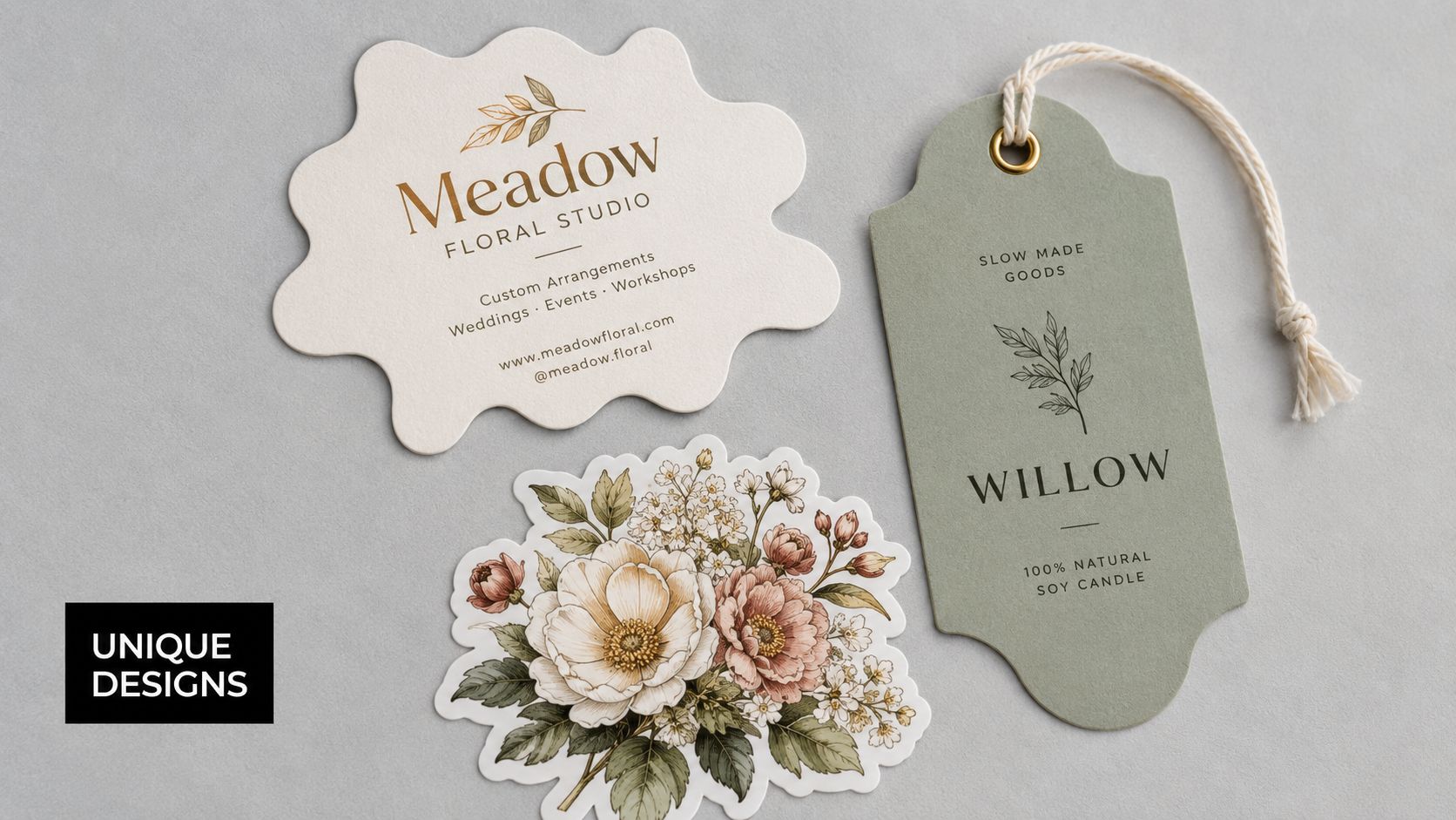
A shaped logo sticker is one of the easiest examples. The same logo in a rectangle feels like a label. Cut to the contour of the mark, it feels like merchandise. People are more likely to keep it, stick it on something, and treat it like a branded object instead of a throw-in.
Custom-shaped business cards can do the same thing if the shape connects to the business. A bakery card with a soft rounded edge, a salon card with a mirror silhouette, or a pet brand card built around a paw outline can be memorable without becoming hard to read.
Hang tags are another quiet win. Apparel, gift items, candles, and boutique food products often benefit from a shaped tag because it adds polish before the customer even uses the product.
For businesses that hand out branded items at events, local fairs, or counters, a broader list of promotional items to give away can help you pair die cut pieces with other low-cost giveaway ideas.
Packaging details that raise perceived value
Die cut labels help products stand out on crowded shelves because the shape can echo the package. A honey jar with a custom label feels more considered than the same jar with a plain square sticker. A soap wrap with a shaped closure seal can make a small handmade product look more retail-ready.
Shaped inserts and small cartons matter too. Even a simple window cut, rounded flap, or custom closure can make packaging feel like part of the product instead of an afterthought.
Here’s a quick production video that shows why cut shape changes the finished piece so much more than is often realized.
A few strong uses show up again and again in small business work:
- Logo stickers: Good for order inserts, laptops, packaging, and casual brand exposure.
- Product labels: Good for jars, bottles, boxes, and handmade goods that need shelf presence.
- Hang tags: Good for apparel, gifts, and products that need a tactile, premium detail.
- Shaped cards or mini handouts: Good when you want a leave-behind that won’t get ignored.
The best part is that die cut printing scales across small ideas. You don’t need a giant packaging line to use it well. A sticker, seal, tag, or insert can carry a lot of branding weight.
Frequently Asked Questions About Die Cut Printing
Small business owners usually reach this point with the same concern. The shape looks great on screen, but they want to know what it will cost, how fast it can be produced, and whether that clever outline will hold up once it becomes a real sticker, label, or carton.
How does pricing work for small runs
Pricing usually comes down to one early choice. Will the job use a physical steel-rule die, or will it be finished digitally with a laser or digital cutter?
A physical die works like a custom cookie cutter. You pay to make the tool first, then it earns its keep when you reuse the same shape over multiple runs. That makes sense for a product label you plan to reorder all year. It is harder to justify for a seasonal promo sticker, a packaging test, or a one-time event handout.
For short runs and changing artwork, digital die cutting often saves money because there is no tooling charge. That is why small businesses often start there, especially for prototypes and limited quantities, as noted in custom die-cut printing guidance from iPrint360.
The practical question is simple. Are you buying a repeatable production shape, or are you buying flexibility? If the shape may change next month, paying for a steel-rule die too early usually wastes budget.
How fast can a die cut order be turned around
Turnaround is usually set by file quality, shape complexity, and finishing method.
A clean file with a clear cut path can move fast through a local shop. A messy file with missing bleed, unclear layers, or a cut line sitting too close to the artwork slows everything down because somebody has to repair it before production starts. That extra time is avoidable, and on a short-run job it can matter more than press time.
Complex shapes also take longer to check. Lots of tiny points, narrow bridges, and deep inward cuts are where approval and production tend to stall.
If speed matters, send the art early and ask for a proof before you promise a delivery date to your own customer. That one habit prevents a lot of last-minute trouble.
Will sharp corners and thin details cause problems
Yes.
Sharp inside corners, little spikes, and very thin connecting areas are some of the first places a die cut piece starts to fail. What looks crisp on a monitor can tear during stripping, catch during handling, or wear out faster once the piece is in use. This shows up often on logo stickers, shaped decals, and packaging windows where the design pushes too close to the limit.
Cleaner shapes usually print and cut better. Rounded inside corners, slightly thicker bridges, and a little breathing room near the outer edge give the finished piece a more polished look. They also reduce the chance that a sticker peels oddly or that a folded package weakens at the cut.
Registration matters too. If the artwork sits right on the edge, even small cut variation becomes visible right away. A borderless look can work, but it has to be built carefully.
Why do some labels crack, curl, or fail after printing
The problem is often the material and structure, not the print itself.
Paperboard, vinyl, coated paper, and textured stocks all react differently to cutting, folding, pressure, and temperature. Grain direction matters on folding cartons. Adhesive choice matters on labels. A dramatic shape that works on a soft paper sticker may become a headache on a thicker face stock or a rigid board.
Paper Print Services notes that moisture, shop temperature, and grain direction all affect die cutting performance, especially on folding board, and that crease direction can influence cracking on SBS packaging stock in a big way, according to paper die-cutting guidance on moisture, temperature, and grain direction.
That is the kind of issue people often blame on “bad printing” when the problem is stock prep or structural setup.
For labels, curling usually starts with stress points. Tight internal angles, thin tips, aggressive corners, or the wrong material for the surface can all shorten the life of the piece. If a label needs to stay neat on a bottle, jar, or mailer, a simpler outline with rounded corners usually holds up better than an intricate silhouette.
A few habits help:
- Round internal corners: They strip cleaner and resist tearing better.
- Match the shape to the stock: Thick board, paper labels, foil, and vinyl do not behave the same way.
- Check grain and fold direction: Cartons that crack at the crease often have a structural setup problem.
- Keep edge details realistic: The cut should support the product, not fight the material.
Good die cut printing comes from matching the artwork, material, and finishing method to the job you are running, especially when you are ordering short runs and every piece has to count.
If you’re ready to turn a logo, sticker, tag, label, or package idea into a finished piece, Business Mail Boutique LLC can help you sort out the practical side fast. Bring in your concept, a rough file, or even just the product you want to label, and the team can help you choose the right material, shape, and production path for a clean result without overcomplicating the order.

Related posts

Custom Memorial Glasses Engraved in Three Hours in Sugar Land
When a customer needed eight personalized glasses for a memorial, Business Mail Boutique completed the engraving or...

Custom Martini Glass Engraving in Sugar Land, TX
Custom Logo Engraving on Martini Glasses in Sugar Land, Texas.
Business Mail Boutique recently completed a beautiful custom engravin...

Custom Engraved Wine Glasses for a Golf Club Event in Sugar Land, TX
Custom Engraved Wine Glasses for a Golf Club Event in Sugar Land.
Custom wine glass engraving in Sugar Land, TX at Business Mail Bouti...