
- Print Business Cards in Sugar Land – Same Day Service
- Copying Services
- Document Printing, Finishing & Lamination in Sugar Land
- Flyers
- Print Banner in Sugar Land | Same-Day Banner Printing Near Me
- Graphic Design
- Photo Printing
- Postcard Printing
- Document Printing
- EDDM Full Service Postcards
- FotoZoomer Large Format Printing


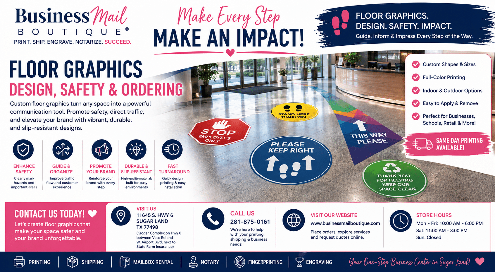
Floor Graphics: Design, Safety, and Ordering.
Transform your space with custom floor graphics. Our guide covers design, materials, safety standards, and how to order for retail, events, and more.
Businessmailboutique
11645 S. Hwy 6
Sugar land, Texas 77498 United States (US)
Email: info@businessmailboutique.com
Route
You’re probably looking at a stretch of floor right now that isn’t doing much for your business. Maybe it’s the space just inside the front door, the aisle endcap nobody notices, or the path customers already take on the way to checkout. That space can carry a promotion, point people where they need to go, reinforce your brand, or mark a safer walking route without adding clutter to shelves, counters, or walls.
That’s why floor graphics work so well for small businesses. They use space you already have. But they only work when the material matches the floor, the design reads quickly, and the installation is done right. A pretty decal that curls at the edge, turns slick when wet, or peels after routine cleaning becomes a problem fast.
An Introduction to Floor Graphics
Floor graphics are printed visual decals made for foot traffic areas. In practice, they’re used to direct, promote, warn, or brand. The best ones feel obvious to the customer. They tell people where to stand, where to walk, what to notice, or what kind of business they’ve just entered.
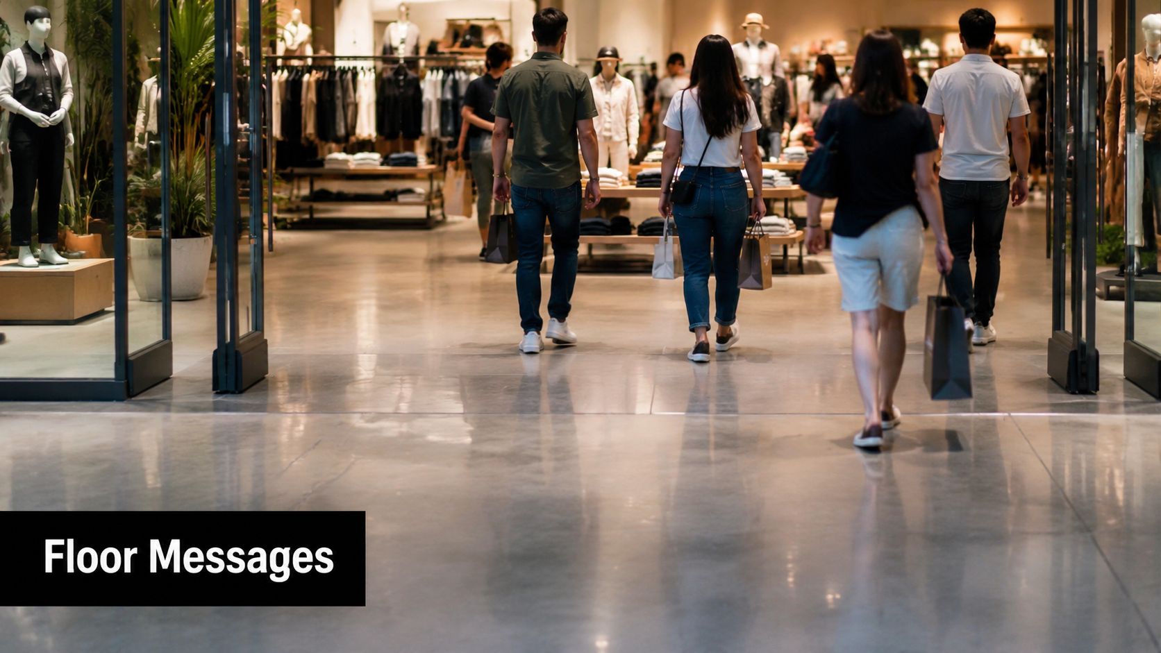
A lot of business owners still think of floor graphics as a niche product used only for big retail promotions. That’s outdated. The global market for floor displays, including graphics, was valued at USD 2.8 billion in 2025 and is projected to grow to USD 5.0 billion by 2036, with 62% of in-plant printing facilities now offering floor graphics as a standard service, according to Future Market Insights’ floor displays market report.
Where floor graphics fit best
Small businesses usually get the best results when they use floor graphics for one clear purpose at a time:
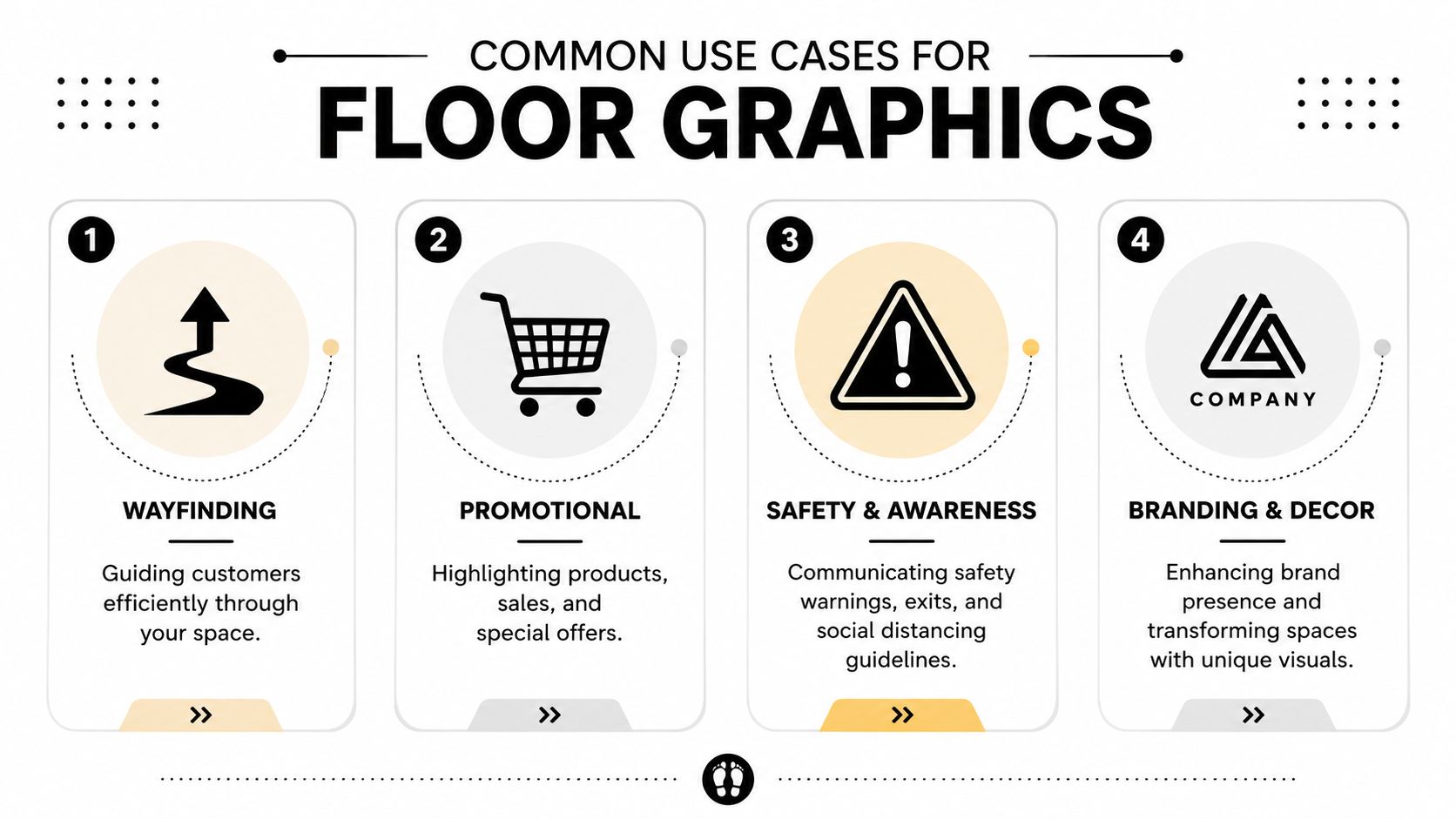
- Wayfinding: Arrows, footprints, lane markers, and entrance-to-counter guidance
- Promotions: Product callouts, limited-time offers, seasonal launches, and impulse-buy prompts
- Safety messaging: Caution zones, spacing markers, hazard awareness, and directional traffic flow
- Branding: Logos, themed patterns, event graphics, and environmental décor
Floor graphics work because the floor is often less crowded than eye-level surfaces. Customers are already scanning the ground as they walk, turn corners, join a line, or approach a display.
Practical rule: If the message needs more than a few seconds to understand, it probably belongs on a sign, not on the floor.
What local businesses often miss
The first question shouldn’t be “What should it look like?” It should be “What surface is it going on, and who will walk over it?” A floor graphic in a dry boutique has different demands than one in a grocery entrance, warehouse walkway, or clinic hallway.
That’s the difference between a graphic that lasts and one that fails early. The graphic itself is only one part of the project. Surface prep, slip resistance, cleaning methods, traffic patterns, and removal all matter just as much.
Unlocking Potential with Common Use Cases
The easiest way to judge whether floor graphics make sense for your business is to look at what they do on the ground. Not in a mockup. Not in a pitch deck. In the daily movement of customers, staff, carts, strollers, and deliveries.
Retail promotions that interrupt autopilot
In stores, shoppers often move on habit. They follow familiar paths, glance at endcaps, and miss products sitting just outside their usual pattern. A floor graphic can break that routine because it appears in a viewing zone people don’t expect to be sold to.
That’s one reason retailers keep using them. Products promoted with floor graphics see consistent sales increases of 10% to 13%, and in some retail settings, strategic placement can boost sales by 20% to 50% by increasing shopper engagement and ad recall, according to WhatTheyThink’s reporting on floor graphics in retail spaces.
Good retail uses include:
- Aisle entry prompts: A simple arrow and product image can push attention toward a seasonal display.
- Endcap support: A floor decal reinforces the message of the shelving display above it.
- Checkout zone promotions: Small-format graphics near queue areas can support add-on items without crowding the counter.
The weak version is a floor graphic with too much copy or no clear tie to the display nearby. If the customer can’t connect the decal to a product within a step or two, it loses force.
A quick demonstration helps:
Events and temporary activations
Events are one of the cleanest use cases because the floor becomes part of the experience. A printed path can lead attendees from registration to a booth. A sponsor logo at the entrance can set the visual tone immediately. A directional graphic can reduce hesitation in larger halls where overhead signs get missed.
Short-term event graphics usually succeed when they do one of these jobs:
- Lead traffic toward registration, breakout rooms, or featured exhibits
- Define zones such as photo areas, waiting spots, or branded activations
- Carry theme elements that make the space feel finished without expensive build-outs
What doesn’t work is treating the floor like a flyer. Event attendees are moving. They won’t stop to read a paragraph underfoot.
Wayfinding in offices clinics and public spaces
Wayfinding is where floor graphics often outperform wall signage. At decision points, people naturally look down and around. A floor arrow at a hallway intersection often gets read faster than a wall placard placed off to the side.
This is especially useful in spaces where visitors feel uncertain:
- Medical offices: Directing patients to check-in, labs, or restrooms
- Large offices: Guiding guests from reception to conference rooms
- Schools and community venues: Marking routes during events, pickup flows, or testing days
Clear wayfinding reduces hesitation. That matters because every confused pause creates congestion at doors, corners, and service counters.
Safety messaging people actually notice
In workspaces, floor graphics can support behavior, not just appearance. Warehouses use them to mark lanes and hazard awareness zones. Retail backrooms use them to separate walk paths from storage areas. Service businesses use them to mark waiting positions or caution spots near slick surfaces.
The key is clarity. A safety floor graphic should communicate instantly through shape, color contrast, and placement. It isn’t décor. It’s a visual instruction.
When owners treat all floor graphics the same, they usually underbuild safety jobs and overdesign functional ones. Matching the message to the setting is what makes the medium useful.
Matching Materials to Your Surfaces
Material choice is where many first projects go wrong. Owners focus on the print and overlook the floor itself. But the floor decides almost everything. A decal that performs well on smooth sealed tile can fail fast on textured concrete, uneven stone, or a floor that’s been treated with wax or silicone-based products.
Start with the surface, not the artwork.
Think in terms of bond and texture
A floor graphic has to do two jobs at once. It must bond to the surface and conform to it. Smooth surfaces usually need less aggressive adhesive. Rougher or more porous surfaces often need a more specialized film and stronger bond.
Here’s a practical way to discuss options with your printer.
| Material Type | Adhesive | Ideal Surfaces | Durability |
|---|---|---|---|
| Smooth floor vinyl with removable adhesive | Removable | Sealed tile, laminate, polished sealed concrete, finished vinyl flooring | Best for short-term promotions and seasonal campaigns |
| Smooth floor vinyl with permanent adhesive | Permanent | Stable indoor commercial floors where long hold matters | Better for longer-term branding or directional use |
| High-tack floor film | High-tack | Harder-to-bond sealed surfaces and demanding commercial settings | Useful when standard removable films won’t hold reliably |
| Textured surface film | Specialty adhesive system | Rougher concrete or outdoor walking areas, depending on product spec | Chosen when the floor isn’t smooth enough for standard films |
| Carpet-specific floor graphic media | Carpet-safe adhesive | Low-pile commercial carpet tiles | Best for event spaces and temporary indoor messaging |
Surface-by-surface decisions
If your floor is sealed concrete, ask whether it’s sealed evenly. Concrete can look smooth and still have dusting, moisture issues, or patchy sealers. Those conditions cause edge lift.
If your floor is ceramic, porcelain, or stone tile, grout lines matter. Wide or recessed grout can telegraph through the graphic and shorten its life. In those spaces, smaller decals that avoid spanning multiple uneven joints often perform better than one large sheet.
If you’re planning a project near an outdoor entrance, looking at surrounding hardscape materials also helps. A tile selection reference such as Tiles Mate’s 2026 buyer’s guide can be useful for understanding how different surface finishes and outdoor tile textures may affect slip, cleaning, and general compatibility planning.
If your job is really a smaller label-style project rather than a true walk-on graphic, it may make more sense to compare it with custom vinyl sticker options for branding and short-run applications. Not every decal belongs on the floor.
What usually causes failure
Most early failures come from one of these issues:
- Wrong adhesive for the substrate: Removable adhesive placed on a demanding floor often lifts at the edges.
- Contaminated surface: Wax, grease, and silicone residues interfere with bonding.
- Overestimating rough surfaces: Standard indoor floor vinyl doesn’t magically adapt to heavily textured concrete.
- Ignoring maintenance routines: Some floors are cleaned with aggressive machines or chemicals that are rough on graphics.
The floor graphic material should match the real floor condition, not the floor condition you wish you had.
Questions to ask before ordering
Bring these details to your print partner:
- What’s the floor made of: Tile, sealed concrete, vinyl plank, wood, carpet tile, or something else
- How is it cleaned: Mop, auto-scrubber, degreaser, stripper, or specialty cleaner
- Is the job temporary or long-term: A weekend event needs a different build than a permanent wayfinding program
- What traffic crosses it: Foot traffic only, carts, rolling racks, or pallet jacks
- Is there moisture nearby: Entrances, drink stations, refrigerated areas, and restrooms all change the recommendation
The more specific you are upfront, the fewer expensive surprises you’ll have after install.
Designing Graphics That Direct and Delight
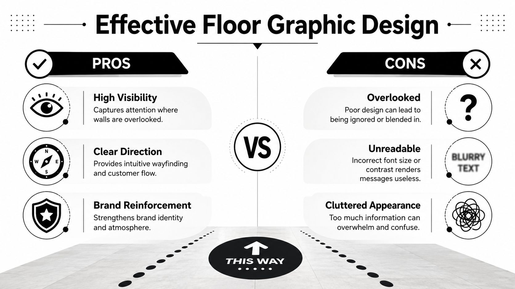
Floor graphics have a short window to work. People are walking, turning, carrying bags, pushing carts, or talking to someone beside them. That means the design has to communicate faster than a poster would. Strong floor graphics aren’t just attractive. They’re legible at a glance and obvious in motion.
Use fewer elements than you think you need
Most first drafts are too busy. Owners want the logo, website, phone number, offer, product photo, QR code, and a tagline all in one shape. On the floor, that usually becomes visual mush.
A stronger approach is to reduce the graphic to one primary action:
- Go here
- Notice this
- Stand here
- Watch out
- You’re in our space
If the job is promotional, use a short headline and one visual anchor. If it’s directional, let the arrow do the heavy lifting. If it’s branded décor, repeat shape and color consistently instead of packing in copy.
Make it readable from approach distance
Floor graphics are read from an angle, not straight on. That changes how type, contrast, and orientation behave. Thin scripts, low-contrast color combinations, and detailed imagery usually disappear first.
Use this checklist before sending art to print:
- Choose high contrast: Dark-on-light or light-on-dark beats subtle tone-on-tone combinations.
- Keep fonts simple: Bold sans serif faces hold up better than decorative scripts.
- Orient for traffic flow: The graphic should read correctly from the direction customers approach.
- Limit the message: A few words and one clear symbol beat a paragraph every time.
- Scale to the space: Small decals get lost in open areas, while oversized graphics can feel messy in tight aisles.
One useful trick is to print the design on regular paper at reduced scale and look at it from a shallow angle. If the message isn’t obvious then, it won’t improve on the floor.
Shape matters as much as artwork
Rectangles are easy to produce, but they aren’t always the best choice. Circular “stand here” graphics feel natural in queues. Arrows perform better than generic blocks for directional tasks. Product-shaped decals can be memorable in retail if the silhouette remains simple.
For brands that want something more custom than a standard square or circle, reviewing die-cut printing for custom shapes can help clarify when a shaped graphic adds value and when it only complicates installation.
A floor graphic doesn’t need to say everything. It needs to say the next thing.
Common design mistakes on real jobs
The most common problems are predictable:
- Tiny legal copy or extra details that nobody can read underfoot
- Busy backgrounds that fight the flooring pattern underneath
- Brand colors without enough contrast against dark tile or patterned surfaces
- Wrong orientation so half the traffic sees the graphic upside down
- Photo-heavy layouts where the image looks muddy after lamination and foot traffic
Good floor graphic design feels slightly blunt compared with brochure design. That’s not a flaw. It’s what makes it functional.
Ensuring Safety Durability and Easy Maintenance
Safety comes first with floor graphics. If a graphic looks great but creates a slipping hazard, it shouldn’t be installed. This is the part many buyers skip because it isn’t as visible as color, logo placement, or finish. It matters more than all of them.
To be considered safe, floor graphics must meet the ANSI A326.3 standard, which requires a minimum wet dynamic coefficient of friction, or DCOF, of 0.42 to ensure adequate traction in commercial environments, as outlined in PRINTING United Alliance guidance on floor graphic safety.
What DCOF means in plain language
DCOF is a traction measure under wet conditions. For a business owner, the practical takeaway is simple. The walkable surface of the graphic must provide enough grip when moisture is present. That usually comes from the right certified floor graphic media or overlaminate, not from the printed vinyl alone.
If you’re comparing products, ask direct questions:
- Is this product intended for walk-on floor use
- Does the finished construction meet ANSI A326.3
- Is the slip resistance based on the full graphic system, including laminate
- Is it suitable for the exact environment, such as retail, clinic, or entry area
A “durable vinyl” description isn’t enough. Neither is “anti-slip” without a clear product basis.
Durability depends on traffic and cleaning
When owners ask how long a floor graphic will last, the honest answer is “It depends on what crosses it and how it’s cleaned.” Foot traffic is only one variable. Shopping carts, rolling bins, moisture, grit tracked in from outside, and routine maintenance all affect wear.
The weak point is often the edge. Once an edge gets nicked, trapped dirt and repeated friction speed up failure. That’s why placement matters so much. A graphic set directly in the sharp turning path of carts will wear differently from one placed in a straight walking lane.
Field note: A floor graphic near an entrance usually fails from dirt, water, and abrasion before the print itself looks old.
Cleaning compatibility is a real-world issue
A lot of generic advice says floor graphics are “easy to clean,” which is true only in a broad sense. The more useful question is whether the graphic is compatible with your actual cleaning routine. Some businesses use mild cleaners and soft mops. Others use stronger chemical products or automated floor equipment.
The current problem in the market is that many guides still stay vague on cleaner compatibility, even as shops increasingly request anti-slip, textured vinyls for demanding environments and deal with newer cleaning systems. The Linemark strategic guide to high-impact retail floor signage points out that businesses often don’t get specific compatibility information for industrial cleaners or automated cleaning robots, which creates risk when durability matters.
Maintenance habits that help
The right maintenance plan is simple and consistent:
- Remove grit quickly: Dirt acts like sandpaper under shoes and wheels.
- Inspect edges regularly: Catching a small lift early prevents a larger peel.
- Use the approved cleaner: If your print partner specifies one, follow it.
- Avoid harsh abrasion: Aggressive pads and scraping tools can damage the textured surface.
- Replace before it becomes a hazard: A worn graphic isn’t just unattractive. It can become unsafe.
Durability isn’t only about making the print survive longer. It’s about keeping the graphic safe and readable for the full time it stays on the floor.
Your Guide to Ordering Installation and Removal
A smooth floor graphics project usually starts with a good site conversation, not a good file. The printer needs to know where the graphic is going, what floor it’s bonding to, how long it needs to stay down, and who will install it. Once that’s clear, the artwork and production choices get much easier.
What to send when requesting a quote
If you want an accurate recommendation, send more than dimensions.
Include:
- Photos of the floor and surrounding area: Wide shots and close-ups both help.
- Surface details: Tile, sealed concrete, wood-look vinyl, carpet tile, and any known coatings.
- Use case: Promotion, wayfinding, safety marking, event branding, or décor.
- Expected duration: Temporary campaign or long-term installation.
- Cleaning and traffic notes: Especially if carts, moisture, or heavy daily use are involved.
For the artwork itself, ask whether the shop prefers vector files for logos and cut paths. In general, vector art keeps edges cleaner for text and shapes, while raster images need enough resolution to print sharply at final size. Ask for a proof before production, especially if the graphic has directional arrows or multiple panels.
If your project is part of a broader in-store visual package, it can help to coordinate the floor piece with related sign printing for walls, counters, windows, or event displays.
Installation details that affect the result
The bond is won or lost during prep. For a successful bond, floor graphics should be installed on a clean, degreased surface with a temperature between 40–90°F. Multi-panel graphics require a 0.5-inch overlap, and all edges must be re-squeegeed to prevent curling, according to Digital Output’s certified floor graphic installation guidance.
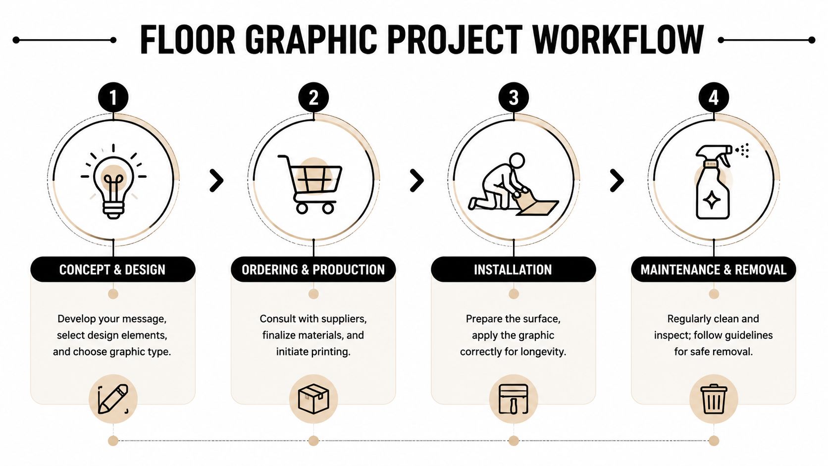
A reliable install sequence looks like this:
- Prep the floor completely: Remove dust, grease, wax, and any residue that interferes with adhesion.
- Dry and condition the area: Don’t install on a damp surface or outside the recommended temperature range.
- Position before peeling liner: Use tape marks or a dry fit so the graphic lands correctly the first time.
- Apply with pressure: Use the proper squeegee technique to avoid bubbles and weak edges.
- Re-squeegee the perimeter: Edge pressure matters more than most first-time installers expect.
Silicone contamination is another common problem noted in that same guidance. If a floor has been treated with a silicone-containing product, bonding can become unreliable.
When to hire the installer and when to do it yourself
DIY installation can work for smaller decals on smooth indoor surfaces, especially for short-term use. It gets risky when the job involves large panels, tricky orientation, textured floors, or public areas where failure creates safety issues.
Hire a pro if:
- The graphic spans multiple panels
- The location is high traffic
- The floor has seams, grout, or texture
- The design must align precisely with architecture
- The graphic serves a safety function
A poor install wastes the print. That’s usually more expensive than paying for proper installation upfront.
Removal without making a mess
Removal should be part of the plan when you place the order. Ask whether the adhesive is meant for clean removal from your specific floor type. Don’t assume every “removable” product behaves the same on every finish.
For most jobs, safe removal means lifting from a corner, pulling steadily at a low angle, and avoiding sharp metal tools that can scratch the floor. If residue remains, use a floor-safe cleaner approved for the surface and test in a small area first. The goal isn’t just getting the old graphic up. It’s leaving the floor ready for the next one.
If you’re in Sugar Land and want help with a floor graphics project, Business Mail Boutique LLC can help you move from idea to finished print with practical guidance on materials, file setup, and production. Whether you’re ordering a short-run promotion, event graphics, or a broader sign package, their local print team can help you choose an option that fits your floor, your timeline, and your budget.

Related posts

Custom Memorial Glasses Engraved in Three Hours in Sugar Land
When a customer needed eight personalized glasses for a memorial, Business Mail Boutique completed the engraving or...

Custom Martini Glass Engraving in Sugar Land, TX
Custom Logo Engraving on Martini Glasses in Sugar Land, Texas.
Business Mail Boutique recently completed a beautiful custom engravin...

Custom Engraved Wine Glasses for a Golf Club Event in Sugar Land, TX
Custom Engraved Wine Glasses for a Golf Club Event in Sugar Land.
Custom wine glass engraving in Sugar Land, TX at Business Mail Bouti...